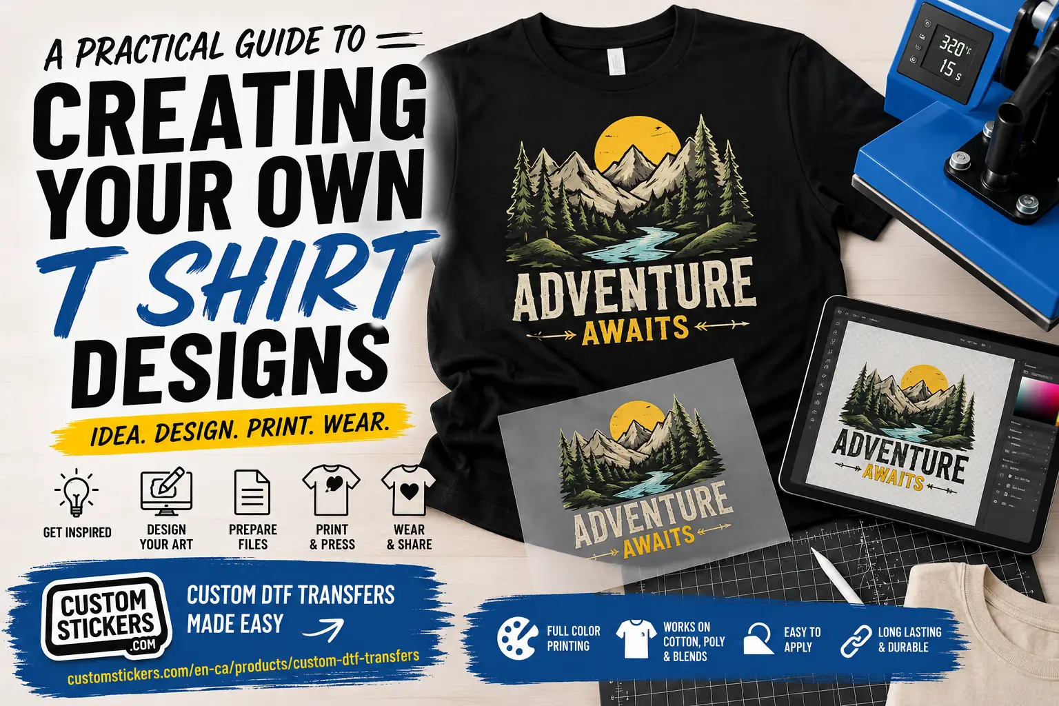
A Practical Guide To Creating Your Own T Shirt Designs
TLDR
Creating your own t shirt designs works best when you start with one clear idea, design for the final shirt size and prepare the file correctly before printing.
For DTF transfers, use clean artwork, strong contrast, a transparent background and high-resolution files at the final print size. CustomStickers.com offers custom DTF transfers you can upload, order and press onto shirts, hoodies, totes and other apparel.
A good shirt design has to survive real life. It has to look good on a screen, on fabric, on different shirt sizes and from a few feet away. That last part is where a lot of designs get into trouble. A shirt is not a poster. People see it while someone is walking, talking, sitting or standing in a group photo.
That is why creating your own t shirt designs is less about making the busiest design possible and more about making a design that reads fast. The best custom t-shirt designs usually have one strong idea, clean artwork and a print method that fits the project.
If you are making shirts for a small business, family trip, event, team, school club or merch drop, DTF transfers are one of the most practical options. You can create full-color artwork without setting up screens for every color, and you can order transfers that are ready to press. You still need good artwork. But you do not need to become a full print shop before making a good shirt.
Start With The Shirt Design Idea
Most shirt designs get better when you simplify the idea early.
Before opening Canva, Illustrator, Procreate or Photoshop, write the idea in one sentence. Not the whole slogan. The concept.
For example:
“This is a shirt for our coffee shop’s summer staff.”
“This is a funny family reunion shirt with a mountain theme.”
“This is a merch shirt for people who like our sticker brand.”
“This is a school club shirt that should look clean enough to wear after the event.”
That one sentence gives the design a job. It also helps you avoid adding things that do not belong.
A design can be funny, bold, minimal, vintage, hand-drawn, mascot-based or text-only. But it should not try to be all of those at once. Pick the lane.
For beginner t-shirt design, these formats are usually easiest:
- Text-First Design: A slogan, phrase or name with strong typography.
- Logo Shirt: A brand mark, club logo or event logo on the chest or back.
- Illustration Shirt: A mascot, drawing, icon or character-style graphic.
- Badge Design: A circular, shield or patch-style design with text around it.
- Merch Drop Design: A design that looks like something someone would wear even if they did not attend the event.
Text-only shirts are underrated. A clean phrase with good spacing often beats a cluttered design with five graphics, three fonts and a clip art flame that nobody asked for.
Choose The Right Design Placement
Placement changes the entire feel of the shirt.
A small left-chest print feels professional and wearable. A full-front print feels more like merch. A full-back print works well for team names, sponsors, event artwork or bold graphics. Sleeve prints can look sharp, but they are usually better as a supporting detail instead of the whole design.
Here is a simple placement guide:
| Placement | Common Use | Design Tip |
|---|---|---|
| Left Chest | Logos, badges, staff shirts | Keep it simple and readable |
| Center Chest | Short slogans, small graphics | Works best with strong typography |
| Full Front | Main artwork, merch designs | Leave open space so it does not feel heavy |
| Full Back | Events, teams, sponsors, large art | Great for bigger layouts |
| Sleeve | Small logo, name or icon | Keep details minimal |
| Neck Label Area | Branding detail | Best for brands or merch lines |
A common mistake is making the design too low. Most front shirt designs should sit on the upper chest, not down by the stomach. Another mistake is making the design too large just because the print area allows it. Bigger is not always better. It can make the shirt feel less wearable.
For DTF transfers, large solid blocks of ink can also feel heavier because the transfer sits on top of the fabric. That does not make DTF bad. It just means open space helps. Instead of printing one giant rectangle, consider breaking the design into separate elements or using negative space around the artwork.
Make The Artwork Print-Ready
This is the part that separates “looks fine on my phone” from “prints cleanly on a shirt.”
For creating your own t shirt designs, file quality matters. A blurry image will not become sharp because it is printed on fabric. A low-resolution logo pulled from social media will usually look rough at shirt size. A white box around the artwork will usually print as a white box unless the background is removed.
A good DTF transfer file should usually have:
- High Resolution: Aim for 300 DPI at the final print size.
- Transparent Background: Use PNG or vector artwork when the design should float on the shirt.
- Correct Final Size: Build the design at the actual size you want printed.
- Clean Edges: Remove leftover background pixels, rough borders and accidental specks.
- Readable Text: Tiny letters may look clever on screen but disappear on fabric.
- Strong Contrast: Make sure the design stands out against the shirt color.
- Outlined Fonts: Convert fonts to outlines when sending vector files so font issues do not change the design.
Transparent backgrounds are especially important. If your artwork has a white square behind it, that square may print. Sometimes that is intentional. Most of the time it is not.
For logos and text-heavy designs, vector files are ideal because they can scale cleanly. For illustrated artwork, a high-resolution transparent PNG can work well. If you are using a design tool like Canva, export the file carefully and check the background setting before ordering.
And yes, zoom in. Not to 800% forever, because that way madness lives. But zoom in enough to catch rough edges, stray marks and tiny bits of leftover background.
Pick Colors That Work On Fabric
A shirt design does not exist by itself. It lives on a shirt color.
Black ink on a dark navy shirt may technically print, but it will not read well. Light gray on white might look subtle in a mockup and nearly invisible in real life. Thin yellow text on a white shirt is also asking for trouble.
Good shirt color choices usually come down to contrast. Dark shirts need light or bright artwork. Light shirts can handle dark artwork. Mid-tone shirts need more care.
DTF transfers use a white ink layer behind the artwork, which helps full-color designs show up on dark garments. That is one of the reasons DTF is useful for black shirts, navy shirts and mixed-color apparel orders. Still, white ink does not fix every design choice. A low-contrast color palette can still feel muddy.
A simple test helps: shrink the design on your screen and step back. Can you still understand it? If not, the shirt may have the same problem.
You should also think about the mood of the colors. A family reunion shirt might work better with softer outdoor colors. A gym shirt might need bold contrast. A coffee shop staff shirt might look better with cream, brown, black or muted green. The shirt color should support the design, not fight it.
Design For DTF Transfers
DTF stands for direct-to-film. The artwork is printed onto a special film, coated with adhesive powder, cured and then applied to fabric with a heat press. For the person ordering, the key point is simple: you upload artwork and receive transfers that are ready to press.
That makes DTF a strong fit for custom t-shirt designs with full color, gradients, small batches and detailed artwork. It works well for logos, event shirts, creator merch, team shirts, hoodies, totes and business apparel.
CustomStickers.com offers custom DTF transfers that can be pressed onto cotton, polyester and blends. The product is a good fit when you already have shirt blanks and want ready-to-press transfers instead of buying DTF equipment, managing white ink or handling adhesive powder yourself.
DTF is especially useful when:
- You want full-color artwork.
- You are printing a small batch.
- You need designs for dark shirts.
- You have gradients, illustrations or detailed logos.
- You want to test a shirt idea before ordering a larger run.
- You want several designs without traditional screen-print setup.
DTF is not always the best choice for every shirt. Screen printing can still make sense for very large runs with simple artwork. DTG can feel softer for some cotton designs. Heat transfer vinyl works well for names, numbers and simple shapes. Sublimation is great for certain light polyester garments.
But for a lot of small brands, events and custom merch projects, DTF is the flexible middle path. It gives you full-color results without forcing you into a large order.
Use Mockups, But Do Not Trust Them Blindly
Mockups are helpful. They show how the shirt might feel as a finished product. They help you check scale, placement and color balance.
But mockups can also lie a little.
A design may look sharper on a digital mockup than it will on fabric. A shirt color may look different in real lighting. A full-front design may look fine on a flat mockup and feel too large once worn. A design that looks good on a size large may feel oversized on a small shirt.
Use mockups as a planning tool, not as proof that the file is perfect.
Before ordering a larger batch, test one transfer or one shirt when possible. This is especially smart for merch drops, brand launches and event shirts where the design needs to look right the first time. A test shirt lets you check size, feel, contrast and wash care before committing to a bigger order.
Common T Shirt Design Mistakes To Avoid
The biggest mistake is starting with too many ideas. A shirt should have one main point. It can have supporting details, but the main idea should be obvious.
The second mistake is using low-resolution art. Social media images, screenshots and tiny JPEGs rarely print well. Start with clean artwork whenever possible.
The third mistake is ignoring the shirt color. Always preview the design on the actual shirt color, not just on a white background.
The fourth mistake is choosing fonts that are hard to read. Distressed fonts, thin scripts and super-compressed type can all work in the right situation, but they get risky fast.
The fifth mistake is using a design that is too large and too solid. With DTF, open space makes the shirt feel better. A giant block of print can look heavy and feel less breathable.
The sixth mistake is forgetting the real use. A staff shirt, merch shirt, bachelor party shirt and charity event shirt all have different goals. Design for the person who will actually wear it.
A Simple T Shirt Design Checklist
Before you order custom DTF transfers, check the design one more time.
Does the design have one clear idea?
Is the text readable from a few feet away?
Does the artwork contrast with the shirt color?
Is the file high resolution at the final print size?
Is the background transparent if it needs to be?
Are there any rough edges, white boxes or stray pixels?
Is the placement right for the shirt?
Would someone wear this after the event?
That last question is useful. If the answer is yes, the design is probably headed in the right direction.
Conclusion
Creating your own t shirt designs gets much easier when you treat the design as a real product, not just a graphic on a screen. Start with one clear idea. Choose a placement that fits the purpose. Use clean artwork, readable text, strong contrast and a print-ready file.
DTF transfers make custom shirts more approachable for small batches, full-color designs and merch testing. You can create the artwork yourself, order ready-to-press transfers from CustomStickers.com and apply them to shirts, hoodies or totes with a heat press.
The best shirt designs are not always the most complicated. They are the ones people understand quickly and actually want to wear.