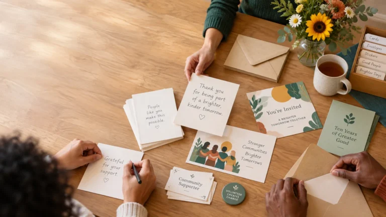
Peer-to-Peer Fundraising for Small Organizations: A Practical Setup

TLDR: A peer to peer fundraising small nonprofit campaign works best when about 10 committed supporters are willing to make personal invitations. Start with one specific funding need, modest individual goals, a short campaign period, ready-to-send messages, and an authorized donation system. Measure fundraiser participation, donor follow-up, and net proceeds—not just the headline total.

The most important resource for a peer to peer fundraising small nonprofit campaign is not a huge social following. It is a manageable group of people who care about the work, understand the request, and will ask friends or relatives to participate. The nonprofit’s job is to make those personal invitations easy, accurate, and trustworthy.

For a first attempt, run a focused pilot rather than a sprawling public campaign. Recruit roughly 10 dependable ambassadors, give them three messages and a clear deadline, and stay available to coach them. That creates a useful test without asking a small staff to manage dozens of inactive pages.

What peer-to-peer fundraising actually involves

In peer-to-peer fundraising, a nonprofit creates a central campaign and supporters raise money through individual pages connected to it. Some platforms also allow participants to form teams. Givebutter’s documentation provides one example of this page-and-team structure, although the exact tools differ by provider.

The defining feature is the personal fundraiser. Instead of every donor receiving the same institutional appeal, an ambassador explains why the cause matters to them and directs people to an authorized campaign page.

Approach Who makes the ask? Best use
Standard donation page The organization Ongoing donations and direct appeals
Crowdfunding campaign Usually the organizer A public project or time-limited need
Peer-to-peer campaign Supporters using connected pages Mobilizing personal networks around one shared goal
Event sponsorship The organization or event committee Business recognition tied to an event or program

An event is optional. A peer-to-peer effort can support a walk, tournament, school activity, birthday, giving day, service challenge, or simple two-week ambassador drive. Choose the format your team can administer consistently rather than the one that looks most elaborate.

When peer-to-peer fundraising fits a small nonprofit

Peer-to-peer fundraising is a good fit when the organization already has several trusted people who will make direct asks. They might be board members, recurring volunteers, alumni, program families, team captains, community-group leaders, or previous event hosts.

Good reasons to start Reasons to delay
At least 8–12 people have expressed real interest The plan depends on strangers discovering social posts
The organization can explain one concrete use of funds The appeal is broad, urgent, or difficult to verify
Someone can coach fundraisers during the campaign Nobody has time to answer participant questions
The donation flow, receipts, and payouts can be tested Fees, data access, or payout procedures remain unclear
The team can thank donors promptly Acknowledgment and follow-up have no clear owner

Delay the campaign if participation is being treated as automatic. Signing up 30 names does not create 30 active fundraisers. A smaller cohort that understands its responsibilities is more valuable than a large list of people who never publish or share their pages.

Choose one manageable campaign model

Keep the first campaign easy to explain. Practical options include:

  • A 14- to 21-day ambassador challenge supporting one program or purchase.
  • A birthday or milestone campaign in which participants dedicate their occasion to the cause.
  • A giving-day effort with supporters sharing coordinated personal appeals.
  • A team challenge connected to an existing walk, tournament, performance, or service event.
  • A registration-plus-fundraising model in which participants join an activity and optionally raise additional support.

One clear purpose makes every other decision easier. “Help us raise $3,000 for 60 after-school activity kits” gives fundraisers more to work with than “Support our mission.” Use only figures and outcomes the organization can substantiate.

Build the goal from supporter activity

Do not select a public goal because another organization used it. Build a planning estimate from the people you can recruit, the number of donors each person may reasonably approach, and an assumed average gift.

For example: 12 active fundraisers × 8 donors each × a $35 average gift = $3,360 in gross revenue. This is an illustration, not a benchmark or promise.

Now test the less optimistic case. If 12 people enroll but only 8 become active, the same assumptions produce 8 × 8 × $35 = $2,240 gross. That $1,120 difference shows why activation and coaching matter.

Gross revenue is not net proceeds. Subtract payment processing, platform charges, event expenses, incentives, printing, postage, and other direct costs. If the campaign grosses $3,360 and has $460 in total direct costs, the illustrative net is $2,900. Before choosing a provider, verify its current fees, optional tipping settings, payout schedule, refund process, integrations, and access to donor information.

Recruit fundraisers with a specific commitment

Begin with personal invitations rather than a mass recruitment email. Explain the purpose, dates, suggested goal, expected time commitment, and support available. Ask each person to confirm that they can set up a page, send several direct messages, and respond to coaching during the campaign.

A modest commitment might include completing a page by launch day, making an initial gift or securing an early gift, sending personal messages to 10 people, posting twice, and thanking donors. Let participants personalize their stories, but do not require them to disclose sensitive experiences.

Recruit a few more people than the campaign model requires, but avoid building the budget on unconfirmed participation. A “yes” should mean that the person understands the work, not merely that they like the idea.

Give every ambassador a minimum viable toolkit

Volunteer fundraisers should not have to write the entire campaign or search for approved facts. Build a compact fundraising campaign visual kit that includes:

  • A two-sentence description of the organization and campaign purpose.
  • A concrete explanation of how funds will be used.
  • Page setup instructions and the campaign deadline.
  • Three adaptable messages: a direct text or email, a launch post, and a final reminder.
  • Approved photos, graphics, captions, and accessibility notes where applicable.
  • A short FAQ covering donations, receipts, privacy, and contact information.
  • Suggested thank-you language for fundraisers to send after a gift.
  • One official donation URL and a tested QR code for physical materials.
  • A contact person who can correct inaccurate pages or answer questions.

At an event or community table, a small sign, handout, or batch of custom campaign stickers can carry the official QR destination. Keep the call to action simple, and always print the short web address near the code so donors have an alternative if scanning fails.

Use a campaign rhythm a small team can maintain

A short campaign still needs active management. Assign one person to participant coaching and one person to donation administration if staffing allows. In a very small organization, the same person can own both roles, but the tasks should still be listed separately.

  1. Recruit and prepare: confirm ambassadors, approve the case for support, and test every page.
  2. Launch: ask participants to make personal contact before relying on public posts.
  3. Check early activity: contact anyone whose page is incomplete or has not received a gift.
  4. Coach at the midpoint: share progress, answer objections, and give participants a fresh message.
  5. Make a final push: emphasize the deadline and purpose without inventing urgency.
  6. Thank and reconcile: acknowledge gifts, review payouts, correct records, and thank fundraisers.
  7. Report back: explain what the campaign funded and offer an appropriate next step.

Do not disappear after the total is announced. A credible donor update worth reading should connect contributions to progress, identify what happens next, and give supporters a meaningful way to remain involved.

Protect donor trust before launch

Online fundraising deserves operational scrutiny. The National Council of Nonprofits warns about problems including campaigns conducted without a nonprofit’s knowledge, inaccurate organizational information, unclear costs, and platforms that interfere with the nonprofit-donor relationship. Its guidance on online fundraising platforms is a useful prompt for reviewing providers and procedures.

Use an authorized campaign account, approve participant claims, and establish a correction process. Test the full donation experience on desktop and mobile. Confirm which organization name appears on statements and receipts, who controls refunds, when funds are disbursed, what donor information is available, and whether donors can control future communications.

Avoid collecting card details through email, paper notes, shared forms, or improvised messaging. PCI Security Standards Council guidance explains that payment-security responsibilities can apply to entities that store, process, transmit, or affect the security of cardholder data. Fully hosted third-party payment pages or properly contained payment frames can reduce exposure, but an organization must still confirm its own responsibilities.

Handle receipts, benefits, and permissions carefully

The IRS says donors need a bank record or written communication for monetary contributions, and acknowledgments should state whether the organization provided goods or services in exchange. Its rules also require a written disclosure for a quid pro quo contribution over $75, explaining that the deductible amount is limited to the payment above the fair-market value of the benefit received. Review the IRS guidance on substantiating charitable contributions when setting up acknowledgments and incentives.

Those federal rules are not a complete compliance checklist. State charitable-solicitation registration and disclosure requirements vary, and campaigns involving raffles, prizes, or paid admission can create additional questions. Seek appropriate professional or state-level guidance when the campaign includes those elements.

Treat permission to process a donation separately from permission to send ongoing marketing. Record the communication choices provided by the donor and use the information only as represented. If the platform limits access to donor identities or contact permissions, understand that limitation before recruiting fundraisers.

Measure the campaign beyond total dollars

Revenue matters, but a first campaign should also show where the system worked or stalled. Track:

  • Fundraiser activation: active pages divided by confirmed participants.
  • Gifts per active fundraiser and gross revenue per active fundraiser.
  • Net proceeds after direct campaign costs.
  • The number of new donors and how many permitted future contact.
  • Acknowledgment completion and average time to thank donors.
  • The number of inaccurate or incomplete pages requiring correction.
  • Fundraisers willing to participate again.
  • Donors or participants who take a consented next step, such as volunteering, subscribing, attending, or giving again.

After the campaign, invite participants to a short review. Ask which messages they actually used, what prevented others from starting, which donor questions repeated, and whether the goal felt credible. Update the toolkit while the experience is fresh.

New donors should not immediately receive an indiscriminate stream of appeals. Start with a useful thank-you and campaign result, then offer a relevant path forward. A simple system for turning one-time participants into long-term supporters can help the organization coordinate that follow-up without overwhelming people.

Start with a small, trustworthy pilot

For a first campaign, I would begin with roughly 10 committed fundraisers, one specific use of funds, three prepared messages, and a 14- to 21-day fundraising window. Confirm fees and data access, test the donation journey, assign responsibility for acknowledgments, and schedule the post-campaign report before launch.

That pilot may not produce a spectacular public total, and it does not need to. Its purpose is to build a repeatable supporter-led fundraising system: people know what to say, donors reach an authorized page, the organization follows through, and the team learns what it can realistically maintain. Start by identifying five likely ambassadors and asking them whether they would make personal invitations for one concrete need.

References

  1. How to use peer-to-peer fundraising | Givebutter Help Center
  2. Protecting Donors, Nonprofits, and Communities from Unethical Online Fundraising Platforms | National Council of Nonprofits
  3. PCI Security Standards Council – Protect Payment Data with Industry-driven Security Standards, Training, and Programs
  4. Substantiating charitable contributions | Internal Revenue Service
  5. www.irs.gov

How to Build a Consistent Visual Kit for a Fundraising Campaign

TLDR

A fundraising campaign visual kit is a compact set of approved messages, images, calls to action, templates, signs, and thank-you materials for one campaign. Build the message first, create one master visual, and then adapt it for your donation page, email, social channels, volunteer outreach, and in-person events. A small organization usually needs fewer assets than it thinks—but every asset should make the next action obvious.

Your kit is not a full rebrand or a folder containing 40 nearly identical social graphics. It is a maintainable campaign system. A volunteer should be able to open it, understand the appeal, select the correct file, and invite someone to give, attend, volunteer, or share without rewriting the campaign from scratch.

What belongs in a fundraising campaign visual kit?

The kit should give your campaign a recognizable identity while keeping attention on the mission and the supporter’s next step. That requires more than matching colors. It requires consistent language, credible impact information, useful formats, and a clear destination for every call to action.

Kit component Minimum viable version Where it is used
Campaign identity Campaign name, one-line promise, and two colors Every campaign touchpoint
Message spine Need, organizational response, supporter role, and proof Appeals, presentations, signs, and scripts
Primary visual One approved photo or illustration with a simple title treatment Donation page, email, social media, and event displays
Impact statements Two or three substantiated statements written in plain language Donation page, appeal copy, and volunteer talking points
Primary call to action One action phrase, such as “Give to stock the pantry” Buttons, signs, email, and social posts
Donation path Short readable URL and tested QR code Print pieces, event signs, slides, and handouts
Channel templates Donation header, email block, two social layouts, and event sign Digital and in-person outreach
Sharing tools Short message, longer message, and approved image Volunteers, board members, and peer fundraisers
Stewardship asset Thank-you message and one adaptable progress update Receipts, follow-up email, mail, and social posts

Start with these essentials and add assets only when a channel or audience creates a real need. A campaign with one email, a donation page, and a community table does not need templates for six social networks. It may need an excellent table sign, a reliable mobile donation page, and a two-sentence sharing script.

Write the message spine before designing anything

A consistent design cannot rescue an inconsistent appeal. Before selecting fonts or photos, write four short statements that everyone can reuse:

  1. Need: What specific problem or opportunity does the campaign address?
  2. Action: What will the organization do with the support it receives?
  3. Supporter role: What are you asking the person to do now?
  4. Proof: What credible program information, past result, plan, or progress measure helps the person understand the work?

For example: “Families arriving at our weekend pantry need shelf-stable breakfast food. Our volunteers will assemble and distribute 300 breakfast boxes in May. A $25 gift helps fund one box. We will report the number of completed boxes and distribution dates after the campaign.” Use that wording only if its amounts and plans are accurate for your organization.

Visual storytelling should provide context rather than use numbers or photographs as decoration. Candid’s guidance on data storytelling for nonprofits recommends connecting data with human stories so audiences can understand the need, the work, and the resulting impact. In practice, that means pairing a campaign number with an explanation of what it represents—and avoiding a dramatic image that has little connection to the funded work.

Create one visual hierarchy that survives every channel

Your master layout should answer three questions at a glance: Who is asking? What is this campaign for? What should I do? Build it around the campaign name, primary image, short promise, and call to action. Keep dates, goals, and URLs in editable fields so they can be updated without rebuilding the entire design.

Then produce variants from that master rather than creating each channel independently. A donation-page header can be wide and restrained. A social graphic may need a shorter title and more surrounding space. A printed table card needs a large action line, QR code, and readable URL. These pieces do not have to be identical; they need to feel related and communicate the same request.

Use a three-tier asset hierarchy

  • Tier 1 — Required: donation-page header, primary image, email appeal block, one square social graphic, event or counter sign, sharing copy, and thank-you message.
  • Tier 2 — Useful for a multiweek campaign: progress graphic, story template, volunteer handout, sponsor slide, reminder email block, and donor update.
  • Tier 3 — Optional: multiple audience-specific graphics, merchandise, decorative installations, countdown series, and platform-specific animations. Produce these only after the donation path and core materials work.

Physical extras can support recognition, sharing, or stewardship, but they should have a defined job. For example, printed supporter stickers might identify campaign volunteers, seal thank-you envelopes, or give participants a small way to display support. They are an optional extension of the visual system, not a substitute for a clear appeal.

Adapt the kit to the supporter’s situation

Consistency does not mean giving every audience the same message. Preserve the campaign promise and visual identity, then adjust the next step to the person’s role.

Audience or channel Primary job of the asset Useful next step
Donation page visitor Explain the need, use of funds, and giving path Complete a gift
Email reader Create enough relevance and clarity to earn a visit Open the donation page
Social follower Make the campaign understandable without requiring prior context Visit, share, or save the campaign
Event attendee Connect the physical experience to an immediate action Scan, type the URL, register, or give
Volunteer or board member Remove the burden of writing an appeal Send an approved message to personal contacts
Sponsor Clarify recognition and campaign connection Confirm participation or share the campaign
Existing donor Show progress and continued stewardship Read an update or take a meaningful next step

For volunteer sharing, provide both a 25-word version and a 75-word version. Include the correct tracked link, one approved image, and a sentence volunteers can personalize. This makes participation easier while reducing accidental changes to dates, claims, or donation destinations.

After the appeal, move supporters into an intentional follow-up path. A useful donor update worth reading can show what happened without turning every communication into another request. For event campaigns, plan how you will turn one-time participants into long-term supporters before the event list begins to cool.

Make QR signs usable rather than merely attractive

A QR code is a shortcut, not the whole message. Some fundraising platforms provide campaign-specific scan-to-donate codes that can be placed on printed or digital materials. Regardless of platform, the sign still needs enough context for a person to decide whether to act.

  • Use a direct instruction such as “Scan to help fund 300 breakfast boxes.”
  • Print a short, readable URL beside the code for people who cannot or prefer not to scan.
  • Send people to the relevant mobile-ready campaign page, not a general homepage.
  • Leave clear space around the code and avoid placing it over a photograph or textured background.
  • Test the final printed proof from several realistic distances and with more than one phone.
  • Check the destination immediately before distribution and again during the campaign.
  • Assign one person to keep the destination active for as long as printed materials may remain in circulation.

If you use separate tracked URLs or source codes for email, social posts, table signs, and volunteer outreach, document them in the kit. Keep the public-facing URL simple even when the underlying link contains tracking information.

Build accessibility into the master files

Key campaign information should appear as ordinary text, not only inside an image. Add text alternatives to meaningful online images, and make the alternative explain the image’s purpose in context. If an image functions as a link or button, its text alternative should communicate that function. The W3C image accessibility tutorial provides practical guidance for these situations.

WCAG 2.2 generally sets a minimum contrast ratio of 4.5:1 for normal text. That is a useful baseline for campaign graphics, but accessibility also requires practical judgment: use readable type sizes, avoid long copy over photographs, do not communicate progress through color alone, caption video, and provide a typed URL beside every QR code.

Test the actual artifact rather than trusting the design canvas. Print the sign at its intended size. View an email on a phone. Enlarge the web page. Ask someone unfamiliar with the campaign to identify the request and next step. Fixing the master at this stage is faster than correcting every exported asset later.

Plan event, recognition, and thank-you materials together

For a gala, benefit, auction, school drive, or community event, the visual kit may also include check-in instructions, wayfinding signs, table cards, sponsor recognition, a presentation slide, volunteer name labels, and a post-event thank-you. Assign an owner and deadline to each item; otherwise, small signs and final slides tend to become stressful last-minute projects.

Decide sponsor recognition before collecting logos. Specify where recognition will appear, accepted file formats, submission deadlines, and how sponsors will be ordered or grouped. Do not promise prominent placement across every asset unless the team can deliver it consistently.

Keep appreciation separate from tax language. In the United States, the IRS says donors need a contemporaneous written acknowledgment to claim a deduction for a contribution of $250 or more. The acknowledgment must also state whether the organization provided goods or services in exchange for the contribution and, when applicable, include the relevant description or good-faith estimate. Tickets, meals, auction items, and supporter merchandise can complicate the wording, so use current guidance and qualified advice rather than improvising receipt language in a graphic.

A warm campaign thank-you can still be personal and visual. Just coordinate it with the organization’s formal acknowledgment process. If you are mailing physical notes, this guide to using custom stickers in donor thank-you mail explores how a small printed extra can support appreciation without overwhelming the letter.

Measure the path, not the attractiveness of the graphics

Do not assume that a polished design caused a campaign result. Track the steps you can observe, compare channels cautiously, and use the information to find friction.

Consider a hypothetical campaign that records 4,000 tracked visits across its channels. If 200 visitors complete a gift, the observed visit-to-gift rate is 200 divided by 4,000, or 5%. If the average gift is $42, those gifts produce $8,400 in gross revenue before processing fees and campaign expenses.

Those figures are an example, not a benchmark. Their value is diagnostic. If an email generates many visits but few completed gifts, inspect the donation page, message continuity, mobile experience, form length, and payment process. If event signs generate few visits, inspect placement, instructions, scan reliability, and whether attendees had a natural moment to act. If visits are scarce everywhere, the problem may be distribution or audience fit rather than design.

  • Record visits or scans by channel when your tools allow it.
  • Track completed gifts, registrations, or volunteer signups rather than stopping at clicks.
  • Calculate gross revenue, known direct expenses, and net proceeds separately.
  • Note which questions supporters asked repeatedly; they may reveal missing information.
  • Save observations with the assets so the next campaign team can use them.

A 4.5-hour production plan for a three-person team

A small team can build a viable kit in one focused session if it limits revisions and assigns clear roles. Suppose three people can each contribute 90 minutes, for 4.5 combined staff or volunteer hours.

Time allocation Task Output
45 minutes Confirm the message spine, campaign facts, primary action, and approval owner Approved campaign brief
75 minutes Create the master visual and donation-page header Editable master plus web export
45 minutes Adapt the master into one social graphic and one QR sign Digital graphic and print-ready sign
30 minutes Write short and long sharing messages Volunteer sharing sheet
30 minutes Draft thank-you and progress-update copy Stewardship copy
30 minutes Test links, QR code, contrast, print proof, and mobile display Correction list and approved files
15 minutes Name, organize, and schedule the assets Usable campaign folder

If time runs short, protect the message, donation path, event sign, sharing copy, and testing. Cut optional graphics before cutting quality checks.

Save the kit so the next campaign starts ahead

At the end of the campaign, archive the editable files, final exports, approved photos, source copy, alt text, QR destinations, tracked links, sponsor files, thank-you language, acknowledgment workflow, and performance notes. Label what can be reused and what must be updated, especially dates, goals, statistics, consent status, URLs, and sponsor commitments.

Your immediate next step is simple: write the four-part message spine and list the channels you will actually use. From there, build one master visual and the smallest set of assets needed to move a supporter from recognition to action to thanks. That is a fundraising campaign visual kit your team can maintain—and your community can use.

References

  1. Data storytelling for nonprofits: Bringing impact into focus
  2. How to use scan-to-donate QR codes | Givebutter Help Center
  3. Images Tutorial | Web Accessibility Initiative (WAI) | W3C
  4. Web Content Accessibility Guidelines (WCAG) 2.2
  5. Charitable contributions: Written acknowledgments | Internal Revenue Service

How to Turn One-Time Participants Into Long-Term Supporters

TLDR

To convert event attendees to supporters, identify individual guests rather than only ticket buyers, collect appropriate contact permission, thank people within 48 hours, show what their participation accomplished, and offer one relevant next step. Track donations, volunteer interest, subscriptions, return visits, and introductions—not just immediate gifts. A simple 30-day follow-up plan is more valuable than an elaborate system your team cannot maintain.

A successful event is not only a transaction or a pleasant evening. It is a concentrated opportunity for people to encounter your mission, meet others who care, and decide whether they want a continuing role. The practical goal is to make that next decision easy without treating every guest as if they arrived ready to become a major donor.

Define what a successful conversion means

An attendee becomes a supporter when they take a meaningful next step that connects them to the work. A first donation counts, but so do volunteering, joining an email list, attending a program tour, introducing a potential partner, registering for another event, starting a recurring gift, or sharing a campaign with friends.

This broader definition matters because event guests arrive through different doors. One person may be a longtime donor’s guest. Another may care about the cause but have little capacity to give. A corporate attendee may be able to organize a volunteer day, while an auction buyer may initially be more interested in the item than the mission. Asking all four people for the same donation at the same time wastes useful signals.

Event revenue therefore tells only part of the story. Track both the money generated that night and the relationships developed afterward. That gives your committee a clearer answer to whether an event created durable participation or simply produced a one-time financial result.

Start the supporter journey before the event

Post-event follow-up works only when you know who attended. Many organizations retain information for the table purchaser, team captain, sponsor, or person who registered a group but never identify the individual guests. Event-fundraising guidance recommends collecting names and contact details for individual table guests and team members so the relationship can continue beyond the original purchaser.

Ask for the minimum information you can use responsibly: name, email address or preferred contact method, connection to the event, and communication choice. When practical, distinguish the purchaser from their guests. Give sponsors and table hosts a simple way to submit attendee names before the event, then let guests confirm or update their own information at check-in.

Be clear about why you are collecting details. Operational event notices are not automatically permission for unlimited promotional communication. Use an unchecked subscription choice where appropriate, retain the consent record, make opting out straightforward, and follow the rules applicable to your organization, jurisdiction, and message type. The FTC provides a CAN-SPAM compliance guide for U.S. commercial email, although organizations should obtain qualified guidance for their specific circumstances.

Your registration and check-in plan can stay modest. Include a source field such as board invitation, sponsor guest, community partner, social media, or previous supporter. Add one relationship tag such as first-time guest, donor, volunteer, sponsor, or unknown. If you use printed invitations, align your RSVP questions with your digital registration fields; professionally produced event invitations and RSVP materials can support that process for galas and benefit events, but the data still needs one consistent destination.

Use the first 48 hours well

Send a concise thank-you while the event is still fresh. Prompt thanks, event results, and feedback collection are useful parts of post-event follow-up. The message should sound like stewardship rather than a receipt with decorations.

A strong first message has four parts: sincere thanks, one vivid mission moment, a concrete result available so far, and a promise of what attendees will hear next. For example: “Thank you for filling the community center on Saturday. Together, guests funded the first stage of our after-school supply program. We are confirming the final total and will share the complete result next week.”

Do not exaggerate preliminary numbers. If expenses, matching funds, auction payments, or refunds are still being reconciled, say that the total is preliminary. A credible update is better than an impressive number that must later be corrected.

Physical acknowledgment can complement the email for donors, hosts, volunteers, or speakers who contributed substantially. A handwritten note or thoughtful donor mail piece may be appropriate; see these ideas for using stickers in donor thank-you mail without letting the extra become more prominent than the gratitude.

Build a simple 30-day follow-up sequence

Small teams do not need a complicated automation map. They need a calendar, an owner for each task, and messages that match the attendee’s relationship to the organization.

  1. Within 48 hours: Thank attendees, share one mission moment, and tell them when to expect confirmed results.
  2. Within one week: Report the result you can substantiate, request brief feedback, and share one useful story or program detail.
  3. Within 7 to 14 days: Make one segmented invitation, such as volunteering, visiting a program, giving, joining an interest list, or registering for the next activity.
  4. Within 30 days: Send a progress update and a second invitation based on the person’s earlier response or known interests.
  5. At 60 to 90 days: Review who acted, who stayed engaged, and who should receive ordinary communications rather than an event-specific sequence.

A donor update should connect support to credible progress and explain what happens next. Avoid converting every update into another appeal. For a practical model, review what makes a donor update worth reading.

Match the invitation to the attendee’s signal

The best next step is usually smaller and more relevant than “Please become a lifelong supporter.” Use what the person did—not assumptions about wealth or commitment—to select the invitation.

Attendee signal Useful first invitation What to avoid
First-time guest Receive a short impact update or attend a program tour An urgent recurring-gift ask with no relationship context
Auction buyer See how event proceeds will be used, then choose whether to stay informed Assuming a purchase equals interest in every campaign
Existing donor Receive results and a tailored stewardship update Sending the same introductory message they received years ago
Event volunteer Join the next volunteer shift or a short debrief Treating donated time as a lead-in to an immediate financial ask
Sponsor or corporate guest Discuss a volunteer day, introduction, or program partnership Sending a generic individual donation appeal
Highly engaged attendee Join a committee, host a small gathering, or make a relevant gift Offering several unrelated calls to action at once

The Association of Fundraising Professionals’ guidance for small teams identifies event-only attendees as a useful group for tailored stories and giving opportunities. It also frames donor data as a stewardship tool that helps organizations respond to a person’s stage of relationship. That is a better use of segmentation than simply dividing people by estimated giving capacity.

Keep segmentation small enough to maintain

For most community organizations, four to six active groups are enough. Start with first-time guests, existing donors, volunteers, sponsors or partners, event purchasers, and people who expressed a specific program interest. One person can have more than one tag, but each follow-up campaign should have a clear primary audience.

Assign one person to maintain the list and one person to approve the messaging. Record the event attended, source, current relationship, communication permission, first follow-up date, next action, and outcome. A spreadsheet can work at modest scale if access is controlled and the team uses it consistently. A sophisticated CRM filled with incomplete records will not solve an ownership problem.

Measure whether you convert event attendees to supporters

Build a funnel that separates identification from action. Useful counts include total attendees, individually identified attendees, permissioned contacts, people who took any next step, first-time donors, volunteer signups, recurring donors, and people still engaged after 90 days.

Consider a 300-person event as an illustrative planning example—not a sector benchmark. Suppose the organization identifies 240 attendees, has permission to contact 180, and sees 45 take a next action within 30 days. The identified-attendee rate is 240 divided by 300, or 80%. The permissioned-contact rate is 180 divided by 300, or 60%. The next-action rate among permissioned contacts is 45 divided by 180, or 25%.

Now separate those 45 actions: perhaps 18 people donate, 12 volunteer, nine register for another program, and six arrange an introduction or meeting. If five of the 18 donors choose a $15 monthly gift, that represents $75 in monthly commitments, or $900 over 12 months if all five gifts continue for the full year. That calculation is a planning projection, not guaranteed revenue.

These numbers reveal where the system needs attention. A low identification rate points to registration or check-in. A large gap between identified guests and permissioned contacts points to the invitation and consent process. Strong email engagement but few next actions may indicate an irrelevant or confusing offer.

Avoid the most common follow-up failures

  • Keeping only the purchaser’s information and losing contact with table guests, sponsor guests, or team members.
  • Sending every attendee the same generic message regardless of their existing relationship.
  • Making a blanket donation request immediately without first thanking people or showing impact.
  • Including five or six calls to action in one message, forcing the reader to decide what matters most.
  • Failing to assign follow-up tasks before the event, when staff and volunteers are already tired.
  • Automating so aggressively that current donors receive introductions or volunteers receive inappropriate financial pressure.
  • Measuring only immediate gifts and overlooking volunteer, advocacy, partnership, and return-attendance actions.

Handle receipts and event benefits carefully

In the United States, a donor generally needs a contemporaneous written acknowledgment to substantiate a charitable contribution of $250 or more, subject to applicable rules and exceptions. This acknowledgment is not the same as your warm stewardship message, although both can be delivered in a coordinated process.

Ticketed events require additional care when guests receive meals, admission, merchandise, or other benefits. IRS guidance explains that disclosure is generally required for a quid pro quo payment over $75, and the potentially deductible portion is limited to the amount paid above the value of the goods or services received. Auction purchases and sponsorship packages can create further questions. Describe benefits and good-faith values accurately, keep financial acknowledgments separate from unsupported tax advice, and consult a qualified adviser for complicated cases.

Make follow-up part of event planning

The best time to design event follow-up is before invitations go out. Assign how individual guests will be identified, where their permission will be recorded, who will send the first thank-you, when results will be available, and which next steps will be offered to each audience.

Start with one manageable commitment: every identifiable, permissioned attendee will receive a genuine thank-you within 48 hours and one relevant invitation within two weeks. That simple operating standard can turn an event from a one-night transaction into the beginning of a supporter relationship your organization is equipped to sustain.

References

  1. [VIDEO] Where to Find Potential Donors to Support Your Cause – Bloomerang
  2. www.ftc.gov
  3. Fundraising Event Follow-up: Build Donor Loyalty
  4. How Small Teams Can Use Donor Data Like the Big Shops Do | Association of Fundraising Professionals
  5. Charitable contributions: Written acknowledgments | Internal Revenue Service
  6. Substantiating charitable contributions | Internal Revenue Service

What Makes a Donor Update Worth Reading?

TLDR: Strong nonprofit donor update content tells supporters what their help made possible, backs that story with one or two verified details, and explains what comes next. It should be brief, credible, and easy to produce repeatedly. Most updates do not need another donation request; a reply, event invitation, volunteer opportunity, or link to learn more may be the better next step.

A donor update is worth reading when it closes a loop. The donor gave because something needed to happen. Your update shows what has happened, what is still underway, and where their support fits. It does not need the polish of an annual report or a dramatic success story. It needs useful information, human context, and an honest next step.

The four parts of effective nonprofit donor update content

A small organization can build almost every update from four parts. This structure works for a program milestone, fundraising campaign, community event, collection drive, or volunteer-led project.

  1. Name a specific activity or milestone. Say what the team did, where it happened, or which stage the project reached. “We held three Saturday food distributions” is more informative than “Your generosity is changing lives.”
  2. Add respectful human context. Describe a relevant moment, need, or participant perspective without exposing private information. Use names, quotations, photographs, and identifying details only when you have appropriate permission.
  3. Include one meaningful, accurate number. Choose a figure that helps readers understand the work: households served, volunteer shifts filled, kits distributed, classes completed, or funds allocated. Explain what the number measures rather than presenting a pile of statistics.
  4. Explain what happens next. Tell readers what the team is doing, what remains uncertain, and how they can stay connected. A clear next step can be as simple as reading a field note, registering for an event, volunteering, replying with feedback, or sharing the update.

The strongest detail is not necessarily the largest number. If a campaign funded 80 supply kits and volunteers have assembled 52, those two figures tell a useful operational story. The organization can say that assembly is underway without claiming all 80 kits have reached recipients.

Know which message you are sending

Receipts, thank-you notes, updates, and reports all serve different purposes. Combining them is sometimes convenient, but your team should still know which job each message must perform.

Message Primary job Typical content
Donation receipt or acknowledgment Document the contribution Gift date and amount, organization information, and required goods-or-services language where applicable
Thank-you message Recognize the donor promptly Gratitude, the purpose of the gift, and a warm confirmation that it was received
Donor update Report progress and maintain connection A milestone, human context, a meaningful number, and the next step
Campaign or event closeout Resolve a time-bound effort Amount or participation achieved, use of resources, immediate activity, and unfinished work
Annual summary Show the broader year Major activities, selected results, financial context, lessons, and priorities

For U.S. organizations, an informal impact email should not be assumed to replace an official charitable acknowledgment. The IRS says donors generally need a contemporaneous written acknowledgment to substantiate a single charitable contribution of $250 or more. It also describes disclosure requirements for quid-pro-quo contributions exceeding $75. Required wording depends on whether the donor received goods or services, among other factors. Keep a reliable acknowledgment process even if you also send warm thank-you messages and impact updates. The IRS substantiation and disclosure guidance provides the official details.

That separation helps the donor, too. A receipt answers, “What did I give?” A stewardship update answers, “What is happening because people like me participated?” If you include both in one email, make the official record easy to identify and retain.

Use a cadence your team can sustain

There is no universal schedule guaranteed to improve retention. A useful cadence is one your organization can maintain with accurate information and clear ownership. For a small team, the following operating model is a reasonable place to start:

  • Send the receipt or official acknowledgment promptly through your established process.
  • Thank the donor and set expectations. Tell them what kinds of updates they can expect and how frequently you generally communicate.
  • Send a post-gift or post-campaign update when there is something concrete to report, even if the final outcome is still being measured.
  • Use periodic updates to connect several related milestones rather than sending a message for every small activity.
  • Close the loop after a campaign or event with attendance, fundraising, volunteer, or distribution information that has been verified.
  • Provide annual documentation and a broader summary when appropriate for your organization.

A quarterly update may suit a volunteer-run group that gathers program information slowly. A nonprofit conducting frequent classes or distributions may have enough substance for a monthly note. Consistency matters more than an ambitious calendar that collapses after two issues. The Association of Fundraising Professionals emphasizes clarity, consistency, and creativity in donor communications, while treating reporting and relationship-building as parts of stewardship.

Segment by what supporters need to know

You do not need a complicated automation system to make updates more relevant. Begin with three groups whose relationships with the organization are meaningfully different.

  • First-time donors: Confirm that their first gift entered a real process. Explain the immediate activity and introduce one easy way to learn more.
  • Recurring donors: Show cumulative progress and continuity. Connect their dependable support to work that also happens repeatedly, such as weekly meals or monthly workshops.
  • Event, campaign, and volunteer supporters: Report on the project they experienced. Recognize participation as well as money, and offer a related next opportunity.

Add more segments only when you can maintain them. Major or restricted-gift donors may require updates tied to agreed purposes. In-kind donors often want to know whether supplies were useful and what future specifications matter. Lapsed donors may benefit from a broad mission update, but should not receive language that falsely implies recent participation.

Honoring donor intent and maintaining accountability are fundamental ethical fundraising practices, not optional communication flourishes. If money was restricted to a particular activity, report on that activity and do not casually credit the gift with unrelated results.

Do not make every update another appeal

An update can include a donation request when there is a genuine, timely need connected to the progress being reported. It should not automatically become an appeal merely because the email list contains donors. Repeatedly moving from “thank you” to “give again” can keep the organization from fully completing the stewardship moment.

Choose one next step that matches the story. Invite a donor to attend the next community day, register for a volunteer shift, send a question, read a detailed program note, or share an event. If the update describes mailed thank-you materials, a team can also review practical ideas for using stickers in donor thank-you mail without confusing the extra with the thank-you itself.

Turn one verified field note into several useful pieces

Content production becomes manageable when the program team supplies one verified note and the communications team adapts it. The goal is not to copy identical text everywhere. It is to preserve the same confirmed facts while changing the length and emphasis for each setting.

Starting material Donor email Other useful versions
Program milestone Explain what occurred, one number, and the next stage Short social post, board update, annual-summary entry
Volunteer recap Show the task completed and why it mattered Volunteer thank-you, event remarks, recruitment note
Consented participant quote Add context around the person’s own words Social post or presentation slide within the scope of consent
Campaign closeout Report confirmed funds, activity, and remaining work Website update, team briefing, future campaign notes

Create a simple intake form with five fields: date, activity, verified number, source or staff owner, and permission status for any story or image. Add a sixth field for unresolved information. That last field prevents a promising estimate from quietly turning into a published fact.

A worked example for a campaign still in progress

Suppose a neighborhood group raised money for 80 school-supply kits. It has purchased the supplies and volunteers have assembled 52 kits, but distribution will not occur until the school confirms family pickup arrangements. A responsible update could say:

“Thanks to 46 donors and 18 volunteers, supplies for 80 student kits have been purchased. Volunteers assembled 52 kits on Saturday, and the remaining 28 are scheduled for next week. Distribution totals are not yet available because pickup coordination is still underway with the school. If you would like to help finish assembly, our next volunteer session is Thursday evening.”

This update distinguishes funding, assembly, and distribution. It does not claim that 80 students have received kits. It also gives readers a useful action without immediately requesting another gift. Once distribution is complete and confirmed, the team can send a brief follow-up rather than squeezing an unverified outcome into the first message.

Measure follow-through, not just immediate revenue

A stewardship update is doing more than producing clicks. Start by measuring whether your organization completed the communication responsibly: Were acknowledgments sent on time? Did the update reach the intended segment? Were bounced addresses corrected? Did anyone reply with a question, register to volunteer, or attend the next event?

For an update with a specific link, use a basic planning estimate: delivered recipients × click rate × action-page conversion rate. If 2,000 messages are delivered, 2% of recipients click, and 10% of those visitors register, the estimate is 2,000 × 0.02 × 0.10 = 4 registrations. This is a planning scenario, not a promised result.

Be cautious with external email benchmarks. M+R’s 2025 study reports 2024 performance from 216 nonprofit participants, including a 0.48% click-through rate and 0.05% response rate for fundraising email. Those figures describe participating organizations’ fundraising messages, not a universal success standard for stewardship-only updates. Your list, audience, message, and requested action may be materially different.

Over a longer period, look for patterns in repeat gifts, recurring-donor continuity, event participation, volunteer registrations, and replies. Treat these as indicators to investigate, not proof that one email caused a relationship outcome.

Common donor-update failures

  • Treating a receipt as the complete stewardship experience. Transaction records matter, but they rarely explain progress.
  • Using vague celebration in place of information. Gratitude becomes more credible when attached to a specific activity.
  • Publishing outcomes before they are confirmed. Label goals, estimates, activity counts, and final results accurately.
  • Overloading the reader with disconnected metrics. One explained number is usually more useful than ten unexplained figures.
  • Sharing participant details without appropriate consent. Protect dignity and privacy even when a story would make the message more emotional.
  • Ignoring restricted-gift intent. Report against the purpose for which the contribution was accepted.
  • Building a cadence that depends on heroic effort. A simple quarterly update produced reliably is better than a monthly promise the team cannot keep.
  • Hiding delays or changes. Explain what changed, what remains true, and what the organization is doing next.

Build the smallest reliable donor-update system

Start with one calendar, one owner, and one verified program note each month. Decide who confirms numbers, who checks consent, who drafts the update, and who approves it. Keep a reusable template with spaces for the milestone, human context, key number, unresolved issue, and next step.

Your first version does not need to represent every program. Choose one recent campaign or activity that donors will recognize. Write 250 to 500 words, verify every concrete claim, and offer one relevant action. Then record what was difficult to obtain so the next field-note process improves.

A donor update becomes valuable through repeated, trustworthy closure. Show the work, respect the people involved, distinguish confirmed results from work in progress, and tell supporters how they can remain connected. That is a system even a small team can maintain—and a message donors have a reason to read.

References

  1. Charitable organizations: substantiation and disclosure requirements | Internal Revenue Service
  2. Publication 1771 (Rev. 11-2023)
  3. The 3 C's of Donor Communications | Association of Fundraising Professionals
  4. Ethical Fundraising | National Council of Nonprofits
  5. Benchmark Yourself | M+R Benchmarks 2025
  6. Home | M+R Benchmarks 2025

What Does “99% Pure” Actually Mean on a Peptide?

If you’ve spent any time reading about research peptides, you’ve probably seen a number like this:

Purity: 99%+

It sounds straightforward.

If something is 99% pure, then 99% of the material must be the peptide and 1% must be something else, right?

Not necessarily.

In peptide testing, “99% purity” usually refers to the result of a specific analytical test, most often high-performance liquid chromatography, or HPLC. It does not automatically mean that 99% of everything physically sitting in a vial is peptide by weight.

That distinction may sound technical, but it’s one of the most useful things a newcomer can learn about peptide quality.

“Purity” Needs a Measurement Behind It

The first question to ask whenever you see a purity claim is:

Pure according to what test?

For synthetic peptides, HPLC is one of the most widely used analytical tools for assessing peptide-related impurities. A recent review of peptide drug quality found that reversed-phase HPLC remains a standard approach for purity testing, while mass spectrometry and other methods are commonly used alongside it for identification and deeper characterization.

So when a peptide supplier says:

99.4% purity by HPLC

that is much more informative than simply saying:

99.4% pure.

The first statement tells you how the number was obtained.

What Does HPLC Do?

HPLC separates different components in a sample.

A simplified way to picture the process is to imagine dropping several kinds of runners onto a race course.

Some move through quickly.

Others interact more strongly with the course and move more slowly.

They eventually reach the finish line at different times.

HPLC does something similar with molecules.

A peptide sample is carried through a chromatography column. Different compounds interact with the column differently and therefore emerge at different times.

A detector records what comes out.

The resulting graph is called a chromatogram.

What Are the Peaks on an HPLC Chromatogram?

A chromatogram usually contains peaks.

The major peptide may produce one large peak.

Other compounds may produce smaller peaks.

For example, a simplified chromatogram might show:

  • Main peptide: 99.2%
  • Minor component A: 0.4%
  • Minor component B: 0.3%
  • Minor component C: 0.1%

That could lead to a reported chromatographic purity of about 99.2%.

The number generally comes from the relative integrated area of the detected peaks under the test conditions.

It tells you that the major detected chromatographic component dominates the sample.

That’s useful information.

But it still doesn’t answer every question about the vial.

99% HPLC Purity Does Not Mean 99% of the Powder by Weight

This is the part that surprises many people.

A dry peptide sample may contain things that aren’t measured as peptide-related peaks in the same way.

Depending on how the material was made and prepared, a sample can also contain:

  • residual water
  • counterions
  • salts
  • residual solvents
  • formulation components.

So a peptide might have 99% chromatographic purity while its total physical mass includes additional non-peptide material.

Modern peptide quality standards therefore distinguish among things such as identity, purity, assay or peptide content, and impurities rather than treating them as one measurement.

A useful rule is:

HPLC purity is not automatically the same thing as peptide content by weight.

What Are Counterions?

Counterions are another reason vial weight and chromatographic purity can differ.

Many peptides carry electrical charges.

To produce an electrically neutral salt, oppositely charged ions may be present.

Common peptide counterions include compounds such as:

  • trifluoroacetate, often abbreviated TFA
  • acetate.

These counterions can contribute to the total dry mass of a peptide preparation.

Yet they are not necessarily represented as peptide impurity peaks in the same way as truncated or altered peptide sequences.

So if someone sees:

10 mg material

and

99% HPLC purity

it is too simplistic to conclude:

Therefore exactly 9.9 mg must be active peptide molecules.

More information may be needed to make that quantitative statement.

Purity and Identity Are Different Questions

There’s another important issue.

Imagine you test a sample by HPLC and find one giant peak accounting for 99.8% of the detected chromatographic area.

That tells you the sample is dominated by one component.

But what if that component is the wrong peptide?

The HPLC purity number alone would not necessarily catch that problem.

This is why laboratories often use mass spectrometry in addition to chromatography.

FDA research into peptide quality has specifically emphasized the value of combining chromatographic separation with mass-spectrometric methods to characterize peptide active ingredients and peptide-related impurities.

What Does Mass Spectrometry Tell You?

Mass spectrometry measures molecules based on their mass-to-charge ratio.

For a peptide, researchers can calculate what molecular mass the intended sequence should have.

They can then compare that expected value with what the instrument observes.

If the measured data are consistent with the expected mass, that provides evidence supporting the identity of the peptide.

So, in simplified form:

HPLC asks:
How chromatographically clean does this sample appear?

Mass spectrometry asks:
Does the molecular mass support the expected identity?

Those are different questions.

That is why seeing both on a Certificate of Analysis can be more useful than seeing either one alone.

Even Mass Spectrometry Doesn’t Answer Everything

Mass spectrometry is powerful, but it is not magic.

The correct molecular mass does not automatically establish:

  • exact purity
  • exact peptide content
  • sterility
  • bacterial endotoxin levels
  • absence of every possible contaminant
  • biological activity
  • suitability for human use.

Scientists use different tests for different properties.

The 2026 review of peptide quality assessment notes that peptide identity can be supported using multiple orthogonal methods, including HPLC, mass spectrometry, amino-acid analysis, tandem MS, peptide mapping, NMR, and biological assays depending on the application.

“Orthogonal” is just a technical way of saying the methods approach the question from different directions.

What Is a Certificate of Analysis?

This is where a Certificate of Analysis, or COA, becomes useful.

A peptide COA may include information such as:

  • peptide or compound name
  • lot number
  • HPLC result
  • expected molecular mass
  • observed molecular mass
  • testing date
  • analytical laboratory
  • chromatogram
  • mass spectrum.

The exact contents vary.

A COA is most useful when it is connected to a specific production batch.

Why the Lot Number Matters

Imagine a peptide supplier receives one batch in January and another in August.

The chemical name may be identical.

But the two batches were produced separately.

The January test results therefore do not automatically describe the August material.

That is why researchers care about lot-specific testing.

The ideal chain looks like:

Product → Lot Number → Analytical Report

For example, someone evaluating a retatrutide research peptide for laboratory work would ideally look at the HPLC and mass-spectrometry information tied to the actual lot being supplied rather than relying on one generic purity number used indefinitely.

Retatrutide is an investigational molecule, so laboratory research material should also be distinguished from the investigational pharmaceutical formulations used in clinical trials.

What Kinds of Peptide Impurities Can Exist?

Peptide synthesis happens step by step.

That creates several opportunities for related molecules to appear.

Possible peptide-related impurities can include:

  • shorter sequences
  • deletion sequences
  • incompletely modified peptides
  • oxidation products
  • degradation products
  • altered amino-acid forms.

This is one reason peptide analysis can become surprisingly complicated.

FDA research has used high-resolution LC-MS/MS methods to identify peptide-related impurities that may be difficult to fully characterize using conventional HPLC-UV alone.

The cleaner the chromatogram, the fewer significant detectable chromatographic impurities there may be.

But “clean chromatogram” still doesn’t mean “every possible quality question has been answered.”

Why Does This Matter for Research?

If you’re just curious about peptides, the difference between 98.9% and 99.3% may sound trivial.

In some experiments, it may be.

In others, impurities can matter a great deal.

Imagine a receptor assay where a peptide-related impurity still has some biological activity.

Or a stability experiment where degradation products grow over time.

Or an analytical method being developed specifically to detect small changes in molecular composition.

If researchers don’t know what material they started with, interpreting the results becomes harder.

That is why analytical characterization is part of good experimental design.

Does Higher Purity Always Mean Better?

Not necessarily in every research situation.

A higher purity specification usually requires more purification.

That can increase:

  • cost
  • production complexity
  • time
  • loss of material during purification.

Some early screening experiments may not require the same purity level as highly sensitive biochemical work.

The appropriate specification depends on the experiment.

This is another reason a single purity percentage should not be treated as a universal quality score.

What Should a Layperson Look For?

You don’t need to become a chromatography expert to evaluate a peptide-testing claim more intelligently.

A few simple questions help.

Does the supplier say how purity was measured?

“99% by HPLC” is more useful than “ultra pure.”

Is identity tested separately?

Mass spectrometry or another appropriate identity method provides information HPLC purity alone does not.

Is the testing lot-specific?

The report should ideally match the batch being supplied.

Can you see the underlying report?

An actual chromatogram or analytical report provides more context than a badge saying “third-party tested.”

Are the claims limited to what the test actually shows?

A company should not use HPLC purity as proof of sterility, clinical safety, or pharmaceutical approval.

Does 99% Purity Mean a Peptide Is Safe?

No.

This is probably the most important takeaway.

Analytical purity and safety are different concepts.

A chemical can be extremely pure and still be toxic.

Another compound can be safe for an intended use at one dose and harmful under different conditions.

Clinical safety requires much more than chemical purity.

For approved peptide medicines, regulators evaluate extensive information about manufacturing, formulation, stability, toxicology, clinical effectiveness, and adverse events.

A research peptide COA is not a substitute for that process.

Why “Third-Party Tested” Is Only the Beginning

Independent testing can be useful.

Having an outside laboratory perform the analysis separates the analytical result from the company selling the material.

But even then, researchers should ask:

What was tested?

Which method was used?

Which lot was tested?

What did the result actually show?

The phrase “third-party tested” sounds reassuring, but the report is where the scientific information actually lives.

Conclusion

“99% pure” sounds like a complete description.

It isn’t.

For peptides, the number usually refers to a particular analytical measurement, often chromatographic purity determined by HPLC.

That tells researchers something important about the sample.

But it does not automatically tell them:

  • exactly how much peptide is present by total weight
  • whether the major component is definitely the correct molecule
  • whether the material is sterile
  • whether it is safe
  • whether it is suitable for medical use.

That’s why peptide characterization often combines several pieces of evidence.

HPLC can help describe purity.

Mass spectrometry can help support identity.

Lot-specific documentation connects the tests to the material being studied.

Once you understand those three ideas, a label saying “99% purity” becomes much more meaningful.

References

U.S. Food and Drug Administration. Regulatory Science Research on Complex Mixtures and Peptides. FDA describes the use of HPLC, LC-MS, and LC-MS/MS for peptide characterization and impurity profiling. FDA peptide analytical research

Regulatory and Analytical Considerations for the Quality Assessment of Peptide Drugs. Journal of Pharmaceutical Investigation. 2026. Covers HPLC, mass spectrometry, assay, identity, and peptide-related impurities. Peptide quality assessment review

How Nonprofits Can Use Custom Stickers in Donor Thank-You Mail

TLDR

  • Put the thank-you message first and treat the sticker as a small extra.
  • Design something supporters might genuinely want to use.
  • Campaign-specific artwork often feels more meaningful than a generic organization logo.
  • Use roll labels for repetitive envelope and package applications.
  • A QR code can connect the physical mailing to an impact page, but it should not replace a clear written message.

A donor thank-you letter should feel like a thank-you letter.

That sounds obvious.

But somewhere between fundraising software, mailing lists, tax receipts, logos, annual campaigns, QR codes, and “engagement strategy,” a simple thank you can begin to look like another solicitation.

Adding a sticker can help, provided the sticker feels like a gift rather than another advertisement.

Here is how nonprofits can use custom stickers in donor thank-you mail without making the package feel overbuilt.

Start With the Thank You

The sticker is not the message.

The letter is.

Tell the donor:

  • What they helped support
  • Why the contribution mattered
  • What happens next
  • That the organization noticed their support

Keep the language specific.

“Thank you for supporting our spring food drive” is more useful than a paragraph of vague institutional language.

Then the sticker becomes a small physical reminder of that message.

Create a Sticker Supporters Would Use

Putting the organization’s logo on a sticker is fine.

But consider whether there is a more interesting idea.

A wildlife organization might use an illustrated animal.

A community garden could use a plant design.

An arts nonprofit might feature work from a participating artist.

A school fundraiser could use the mascot.

Other possibilities include:

  • Campaign illustration
  • Volunteer slogan
  • Community landmark
  • Short mission statement
  • Anniversary design
  • Event artwork

A supporter may not want a large institutional logo on a laptop.

They might happily use a good illustration connected to a cause they care about.

Make Campaign Stickers Specific

A general logo sticker can work year-round.

A campaign sticker can feel more like a keepsake.

For example:

River Cleanup 2026

100,000 Meals Campaign

Community Garden Spring Build

10th Annual Benefit Ride

This connects the sticker to something the donor actually helped make happen.

Freedom to Give already discusses the practical side of durable vinyl stickers, but durability is only part of a donor campaign.

The artwork needs a reason to exist too.

Put Individual Stickers Inside the Letter

If the sticker is the gift, place it inside the mailing rather than using it to seal the outside envelope.

The donor should be able to use it.

Common sizes around a few inches work well for:

  • Laptops
  • Water bottles
  • Notebooks
  • Cases
  • Binders

A custom die-cut sticker also gives the organization room to make the shape part of the design rather than putting every cause inside the same circle.

Use Roll Labels for Repetitive Packaging Jobs

Not every sticker needs to be the donor gift.

Labels can also help assemble the mailing.

For example:

  • Envelope seal
  • Branded tissue seal
  • Event packet closure
  • Volunteer mailing identification
  • Campaign code
  • Package label

When staff or volunteers are applying hundreds or thousands of the same design, roll labels are generally easier to organize than individually cut pieces.

That is an operational decision rather than a design decision.

The person assembling 1,500 envelopes will appreciate the difference.

Use QR Codes With a Specific Destination

A QR code can be useful in donor mail.

But “scan for our website” is not especially compelling.

Send the person somewhere relevant.

For example:

See what your donation funded

Watch the project update

Meet the scholarship recipients

See photos from the cleanup

Register to volunteer

The landing page should continue the story the letter started.

And test the actual printed QR code before producing the mailing.

A code that worked at six inches on a monitor still needs to work at its final printed size.

Consider a Small Sticker Series

A series can be useful for ongoing campaigns.

For example, an animal rescue might create four illustrated stickers during the year.

A donor who receives more than one starts to recognize the collection.

The same idea works for:

  • Parks
  • Museums
  • Schools
  • Environmental groups
  • Community events
  • Arts organizations

This creates continuity without sending the exact same logo sticker in every mailing.

Keep the Branding Under Control

A nonprofit thank-you package still needs branding.

It does not need the logo printed six times.

A simple package may include:

  • Logo on the letterhead
  • Campaign artwork on the sticker
  • Organization name on the envelope
  • Website in the footer

That is enough.

The sticker does not need the mailing address, phone number, EIN, social handles, URL, slogan, and a paragraph of mission copy around the edge.

Let it be a sticker.

Give Volunteers an Assembly System

If a mailing has several components, create a simple station.

For example:

  1. Letter
  2. Reply or information card
  3. Sticker
  4. Envelope
  5. Seal
  6. Finished-mail tray

If different donor groups receive different inserts, use clearly labeled bins.

Do not rely on everybody remembering which sticker goes with which letter after two hours of envelope stuffing.

Keep the Gift Proportional

A thank-you sticker should feel like a small gesture.

That is the point.

You are not trying to send something expensive enough to overshadow the donation itself.

A well-designed sticker works because it is:

  • Easy to mail
  • Easy to distribute
  • Visually connected to the cause
  • Useful if the donor likes it
  • Inexpensive enough to use at scale

Make the Mailing Feel Like Appreciation

The best answer to how nonprofits can use custom stickers in donor thank-you mail is to keep the order of importance clear.

First, thank the person.

Then show them what their support helped accomplish.

Then give them a small piece of the campaign they can keep if they want.

The sticker should reinforce the relationship.

It should not feel like the organization found one more empty surface to put its logo on.

Are Vinyl Stickers Waterproof? What Waterproof Really Means

*TLDR

Laminated vinyl stickers can handle rain, splashes, condensation, handwashing, and normal use on water bottles. Many can also survive dishwasher cycles, though heat, detergent, water pressure, surface shape, and application quality affect how long they last.

But “waterproof” does not mean every sticker can remain underwater forever. The vinyl, printing, laminate, adhesive, application surface, and length of exposure all affect performance.

A sticker can survive a thunderstorm and still fail in a dishwasher. It can look perfect after weeks on a water bottle but begin lifting after one afternoon underwater.

So, are vinyl stickers waterproof? In practical terms, high-quality laminated vinyl stickers are waterproof enough for most normal uses. They resist rain, spills, handwashing, condensation, and repeated exposure to moisture. But prolonged submersion, pool chemicals, saltwater, pressure washing, and hot dishwasher cycles create harsher conditions.

The confusion comes from treating a sticker as one material. A printed sticker is actually a layered system. Its performance depends on the vinyl, ink, laminate, adhesive, surface, and application.

Understanding those layers makes “waterproof” much easier to define.

What Does Waterproof Mean for a Sticker?

A waterproof sticker should resist water without the face material dissolving, swelling, tearing, or allowing the printed design to wash away.

Vinyl works well because it is a plastic film rather than an absorbent paper. Water can sit on the surface without soaking through it in the same way it would with an untreated paper sticker.

That does not make every part of the finished sticker equally resistant to water.

A typical laminated vinyl sticker includes four main layers:

  1. A clear protective laminate
  2. Printed ink
  3. A vinyl face film
  4. A pressure-sensitive adhesive

The laminate and vinyl may remain unaffected by water while the adhesive begins lifting from the object underneath. Or the adhesive may hold firmly while an unprotected print becomes scratched or faded.

That is why the better question is not simply, “Is vinyl waterproof?” It is, “Is the entire printed and applied sticker suited to this type of water exposure?”

Major graphic-film manufacturers make this distinction in their own technical documents. Some films are described as having excellent resistance to water while specifically excluding immersion. Specialized films may be separately tested for hours, days, or longer periods underwater.

Waterproof Material and Water-Resistant Printing Are Not the Same

The vinyl face material forms the body of the sticker. Because vinyl does not absorb water like ordinary paper, it is a strong choice for outdoor stickers, vehicle decals, water bottles, coolers, helmets, and equipment.

But the printed image is a separate part of the construction.

Some inks resist moisture well on their own. Others may scratch, fade, smear, or wear down more quickly when exposed to water, soap, friction, and sunlight. The printing method, ink chemistry, curing process, and surface coating all matter.

This creates an important distinction:

  • Waterproof material means the sticker’s base film does not readily absorb or break down in water.
  • Water-resistant printing means the ink can tolerate some contact with moisture without running, fading, or rubbing away.
  • Laminated protection means a clear film covers the print and shields it from water, scratches, sunlight, and handling.

A sticker printed on vinyl but left unlaminated may still survive a splash. But it will usually have less protection from scratches, cleaning, rubbing, and repeated exposure.

CustomStickers prints its waterproof stickers on vinyl and adds a matte or gloss laminate that protects the ink from water and UV exposure. The company lists water bottles, coolers, cars, outdoor use, and dishwashers among the intended applications.

What Sticker Laminate Actually Does

Laminate is a thin, clear protective film applied over the printed surface.

It acts as the sticker’s first line of defense. Instead of water, fingers, cleaning cloths, and sunlight contacting the ink directly, they contact the laminate.

A good laminate helps protect against:

  • Water and condensation
  • Scratches and scuffs
  • Color fading from sunlight
  • Light chemical exposure
  • Hand oils
  • Repeated handling
  • Mild cleaning

Laminate is especially important on water bottles and tumblers because those stickers face more than water. They are handled throughout the day, rubbed against bags, washed with soap, and exposed to changing temperatures.

But laminate does not seal the sticker inside a completely enclosed pouch. The cut edges remain exposed. If water reaches a lifted edge or finds a gap between the adhesive and surface, it may begin working underneath the sticker.

This is why proper application matters almost as much as laminate quality.

Adhesive Performance Is Often the Real Limiting Factor

When a waterproof sticker fails, the vinyl itself is rarely the first part to disappear. More often, an edge begins to lift.

Sticker adhesives are generally pressure-sensitive. They form a bond when the sticker is pressed firmly against a suitable surface. No water, heat, or separate curing agent is needed to activate them.

However, bond strength depends on several conditions:

  • The surface must be clean and dry.
  • The sticker must receive firm, even pressure.
  • The adhesive needs enough contact with the surface.
  • Smooth surfaces usually produce better contact than rough ones.
  • Oils, dust, soap residue, wax, and condensation can interfere with adhesion.
  • Some plastics are naturally harder to bond to.
  • Sharp curves may place constant tension on the sticker edges.

Pressure-sensitive adhesive guidance generally recommends applying to a surface that is clean, dry, and free from grease, oil, lint, and other contamination.

For the strongest result, apply the sticker before the item gets wet. Press across the entire surface, paying particular attention to the edges. Then allow the bond to develop before washing or exposing it to heavy moisture.

A waiting period of 24 to 48 hours is a sensible rule for water bottles, tumblers, coolers, and similar items.

Are Vinyl Stickers Waterproof in Common Situations?

Standard laminated vinyl stickers can reasonably handle many everyday wet conditions. The table below shows where performance is usually reliable and where it may vary.

SituationCan Laminated Vinyl Stickers Handle It?What to Expect
Light rainYesA properly applied laminated vinyl sticker should handle normal rain without damage.
Heavy rain and outdoor weatherYesGood vinyl, laminate, and permanent adhesive are made for repeated weather exposure. Surface preparation still matters.
Condensation on a cold bottleYesCondensation should not damage the vinyl or laminated print. Poorly sealed edges may eventually lift.
Spills and splashesYesWipe the sticker clean rather than leaving liquid around the edges for long periods.
HandwashingYesUse mild soap and avoid scraping, soaking, or aggressively rubbing the edges.
Daily water bottle useYesLaminated vinyl is well suited to bottles and tumblers, especially on smooth surfaces.
Dishwasher cyclesUsually, but performance variesHeat, detergent, water jets, surface shape, and cycle length make dishwashers harsher than handwashing.
Poolside splashesYesOccasional contact with chlorinated water should generally be manageable. Rinse and dry the item afterward.
Swimming or short pool submersionPossiblyShort exposure may be fine, but chlorine, movement, abrasion, and edge exposure can shorten sticker life.
Saltwater splashesUsuallyVinyl films can resist salt and water exposure, but the item should be rinsed with fresh water afterward.
Short freshwater submersionVariesSome stickers may remain unaffected, but standard outdoor durability does not always include immersion.
Prolonged freshwater submersionNot normally recommendedUse a material and adhesive system specifically tested for continuous or extended immersion.
Prolonged saltwater submersionUse a specialized productMarine, industrial, or BS 5609-tested label systems are more appropriate than ordinary promotional stickers.
Pressure washingNot recommendedHigh-pressure water can catch exposed edges and force water underneath the sticker.

These are practical expectations rather than universal guarantees. Sticker construction, adhesive type, surface material, application, temperature, and maintenance can all change the result.

Rain and Outdoor Weather

Rain is one of the easiest situations for a laminated vinyl sticker to handle.

The water typically hits the face of the sticker and runs off. It does not remain under pressure against the adhesive for hours, and it usually has time to dry between exposures.

This is why outdoor vinyl films may be rated for years of exterior use while still excluding underwater immersion from their water-resistance claims. One 3M graphic film, for example, lists excellent resistance to water but makes clear that the rating does not include immersion.

Outdoor sticker life still depends on more than rain. Direct sun, heat, freezing temperatures, dirt, abrasion, and surface condition also affect durability.

For cars, trailers, signs, coolers, and equipment, apply the sticker to a smooth, clean surface. Avoid placing an ordinary sticker over rust, peeling paint, textured plastic, wax, or a heavily curved edge.

Handwashing and Water Bottles

Laminated vinyl stickers are a practical choice for reusable water bottles.

They regularly handle condensation, spills, wet hands, and gentle handwashing. The laminate protects the printed design, while the vinyl prevents water from soaking into the sticker face.

To extend sticker life:

  • Apply the sticker to a clean, dry bottle.
  • Avoid seams and sharp curves.
  • Keep the sticker away from the bottle’s bottom edge, where it may scrape against tables.
  • Press down the entire sticker firmly.
  • Wait at least 24 hours before washing.
  • Wash with mild soap and a soft sponge.
  • Do not pick or scrub at the edges.

Handwashing is generally the safest option because it gives you control over heat, pressure, soap, and contact with the sticker.

Are Vinyl Stickers Dishwasher Safe?

Many laminated vinyl stickers can survive dishwasher cycles, particularly when they use a strong permanent adhesive and are applied correctly to a smooth bottle or tumbler.

CustomStickers identifies its laminated waterproof vinyl stickers as dishwasher safe.

Still, a dishwasher is a tougher environment than rain or handwashing. It combines:

  • Sustained heat
  • High-pressure spray
  • Strong detergent
  • Long exposure to moisture
  • Repeated heating and cooling
  • Friction from nearby items

The bottle itself also expands and contracts as its temperature changes. That movement can place stress on sticker edges.

A sticker that survives one dishwasher cycle may not look identical after 100 cycles. Results can also differ between a smooth stainless steel bottle, powder-coated tumbler, flexible plastic cup, and textured cooler.

For maximum life, place the item on the upper rack, use moderate wash settings, and avoid heated drying when practical. Handwashing remains the lower-risk choice.

Pools and Chlorinated Water

A splash at the pool is much different from leaving a sticker underwater all afternoon.

Laminated vinyl should handle poolside splashes and wet hands. Short periods of submersion may also be fine when the sticker has a strong bond to a smooth surface.

But a swimming pool introduces several extra factors:

  • Continuous immersion
  • Chlorinated water
  • Movement through the water
  • Rubbing against hands, gear, and pool surfaces
  • Heat and direct sunlight
  • Water pressure against exposed edges

For a sticker on a water bottle sitting beside the pool, ordinary laminated vinyl is a reasonable choice. For a sticker placed on equipment that remains underwater, use a product specifically designed and tested for submerged service.

Saltwater and Marine Use

Saltwater splashes do not automatically destroy a vinyl sticker. Some graphic films are specifically rated to resist water, mild chemicals, and salt.

But resistance to salt spray is not the same as long-term underwater performance. 3M technical data for several graphic films lists resistance to salt and water while excluding immersion.

Specialized materials do exist for more demanding marine conditions. One Avery Dennison film data sheet reports no effect after 48 hours of water immersion and includes a separate sea-water resistance test based on half-tide immersion. That rating belongs to that specific film system, not to every vinyl sticker.

For boats, kayaks, surf gear, and marine equipment, think about where the sticker will be placed.

Above the waterline with occasional spray is one thing. Constant immersion, barnacle growth, fuel exposure, cleaning chemicals, and abrasive contact are another.

After saltwater exposure, rinsing the surface with fresh water can help prevent salt and dirt from building up along the sticker edges.

Why Prolonged Submersion Is Different

Rain falls onto a sticker. Submersion surrounds it.

When a sticker remains underwater, water has more time to reach every edge and exploit any small gap between the adhesive and surface. Temperature changes, flexing, chemicals, and water pressure can make that process faster.

This does not mean every standard sticker will immediately fail underwater. Some may remain intact for days or longer. But unless the exact material, print, laminate, and adhesive combination has been tested for immersion, the result is difficult to predict.

For underwater equipment, buoys, marine containers, pool hardware, laboratory containers, and industrial applications, use labels with documented immersion and chemical-resistance ratings.

“Outdoor rated” is not automatically the same as “submersion rated.”

How to Make Waterproof Stickers Last Longer

The sticker’s construction matters, but application makes a large difference.

Start with a hard, smooth surface. Clean away dirt, grease, fingerprints, and soap residue. Allow the surface to dry fully before applying the sticker.

Then position the sticker and press from the center outward. Firm pressure helps the adhesive make full contact and pushes out trapped air.

Pay attention to the edges. Rounded corners and smooth die-cut shapes often handle wet use better than long, sharp points that can catch on hands, sponges, clothing, or equipment.

After application, give the sticker time to bond before exposing it to water.

And when cleaning, avoid attacking the edges. Most stickers do not fail because water passes directly through the center of the vinyl. They fail because an edge is lifted, scraped, or poorly bonded.

What Waterproof Really Means

So, are vinyl stickers waterproof? For rain, splashes, condensation, handwashing, water bottles, and most everyday outdoor uses, a quality laminated vinyl sticker can reasonably be called waterproof.

But the word needs context.

It does not always mean unlimited dishwasher cycles. It does not guarantee permanent adhesion to every plastic or textured surface. And it does not automatically make a standard promotional sticker suitable for months underwater.

The most reliable sticker combines a water-resistant vinyl film, durable printing, protective laminate, suitable adhesive, careful application, and realistic expectations about where it will be used.

That is what waterproof really means.

Best Stickers for Brand Giveaways People Actually Keep

TLDR

  • Die-cut vinyl stickers are the best all-around choice for most brand giveaways.
  • Sticker sheets work well when you have several designs, mascots, or themed graphics.
  • Holographic and specialty stickers can make a limited giveaway feel more valuable.
  • A good giveaway sticker should look like something people would choose, not a small advertisement.
  • Most brands should start with a simple two- or three-inch design and adjust based on where the stickers will be handed out.

A free sticker does not guarantee attention.

People will happily accept a sticker at a trade show, market, concert, or store counter. But accepting one and actually using it are two different things. The sticker has to earn its place on a laptop, water bottle, toolbox, notebook, phone case, or increasingly overdecorated cooler.

The best stickers for brand giveaways balance clear branding with a design people genuinely like. They are durable, easy to hand out, simple to apply, and interesting enough to survive the trip home.

Here is how to choose the right type.

Die-Cut Vinyl Stickers Are the Best Overall Choice

For most businesses, die-cut vinyl stickers are the safest place to start.

Die-cut stickers are individually cut around the shape of the artwork rather than being limited to a square or rectangle. A circular logo can remain circular. A mascot can follow the shape of the character. A wordmark can have a clean contour around the letters.

That custom shape makes the sticker feel more like a finished product and less like a label pulled from a shipping box.

Custom die-cut stickers also work well in many giveaway settings:

  • Trade shows and conventions
  • Farmers markets and craft fairs
  • Retail counters
  • Customer packages
  • Community events
  • Product launches
  • Employee welcome kits
  • Conference bags

CustomStickers.com lists die-cut stickers as its most popular format and specifically recommends them for events, customer packaging, artists, and brand promotion. The stickers can be produced in custom shapes and are individually cut through the backing paper.

For a first giveaway order, a two- to three-inch die-cut sticker is usually a practical choice. Two-inch stickers are easy to pack and distribute. Three-inch stickers provide more room for artwork and tend to feel more substantial.

Larger is not always better. Nobody wants to find space for a miniature billboard.

Sticker Sheets Give People More to Explore

A single sticker works well when you have one strong logo or illustration. But some brands have several designs worth sharing.

That is where sticker sheets become useful.

A sticker sheet can include a mix of:

  • Logos
  • Mascots
  • Product illustrations
  • Short phrases
  • Decorative icons
  • Seasonal graphics
  • Small QR code stickers
  • Social media handles

Instead of asking someone to choose one design, the sheet gives them several. That creates a small sense of discovery and makes the giveaway feel closer to merchandise.

Custom sticker sheets are especially effective for artists, coffee shops, outdoor brands, schools, gaming companies, children’s businesses, and brands with recognizable characters.

The individual designs are kiss cut, which means the stickers are cut through the vinyl while the larger backing sheet remains intact. This keeps the collection organized and makes it easier to hand out several designs as one item. CustomStickers.com allows multiple designs to be arranged on a single waterproof vinyl sheet.

Sticker sheets also provide space around the stickers for a small amount of supporting information. You might include your website, social handle, campaign name, or a simple message such as “Pick your favorite.”

Keep that supporting copy brief. The stickers should remain the main attraction.

Holographic Stickers Work for Limited and High-Interest Giveaways

Specialty materials can make a giveaway feel less ordinary.

Holographic stickers reflect changing rainbow colors as the viewing angle shifts. They work well for artwork with bold outlines, futuristic themes, gaming brands, music merchandise, fantasy designs, nightlife businesses, and limited-edition promotions.

They are particularly useful when you want to create:

  • A convention exclusive
  • A launch-day sticker
  • A VIP customer reward
  • A limited seasonal design
  • A mystery giveaway
  • A collectible series

The material itself adds visual interest, so the design does not need to be complicated.

There is one important tradeoff. Holographic vinyl has a reflective silver base, which can change how printed colors appear. Light colors may look softer, while very dark areas can reduce the visible rainbow effect. Designs with strong contrast and intentional open areas usually make better use of the material.

You do not have to make every giveaway holographic. In many cases, standard vinyl should be the main giveaway and holographic stickers should be reserved for special interactions.

For example, hand everyone a standard logo sticker but give holographic versions to customers who join an email list, complete a booth activity, make a purchase, or attend a launch event.

Clear Stickers Fit Clean and Minimal Brands

Clear stickers allow the surface beneath the design to remain visible. They can look especially good on glass, windows, clear packaging, mirrors, and smooth bottles.

They are a natural fit for:

  • Skincare brands
  • Beverage companies
  • Modern retail businesses
  • Minimalist logos
  • Window-focused promotions
  • Packaging giveaways

But clear material requires more careful artwork.

Very light colors can disappear on light surfaces. Thin lines may be difficult to see. And a sticker that looks clean on a dark water bottle may nearly vanish on a white notebook.

Before ordering a large quantity, think about where the average recipient is likely to place it. Strong outlines, darker colors, and a deliberate white layer can help the design remain readable.

Choose the Sticker Based on the Giveaway

The best sticker format depends on the context.

Giveaway SituationRecommended Sticker
General events and customer ordersDie-cut vinyl sticker
Several designs or charactersSticker sheet
Limited releases and VIP rewardsHolographic sticker
Windows, glass, or clear packagingClear sticker
Outdoor, automotive, or tool useLaminated heavy-duty vinyl
Large events with fast distributionSimple two-inch die-cut sticker
Premium gift bags or influencer mailersThree-inch specialty sticker or sheet

The audience matters as much as the setting.

A camping brand may benefit from a rugged vinyl sticker designed for coolers and storage cases. An illustrator might get better results from a sheet of small character designs. A software company could use a clean laptop-sized sticker with a subtle inside joke.

Start with the object you hope the sticker will end up on. Then design backward from that use.

Make the Design Worth Keeping

The most common giveaway mistake is treating the sticker like a business card.

A logo can work, especially when the logo is already visually strong. But a plain company name with a phone number, address, slogan, social handle, website, and QR code is asking a lot from three inches of vinyl.

A stronger giveaway design usually focuses on one main idea.

Use a Recognizable Brand Element

This could be your logo, mascot, product shape, signature color, or a character associated with the business.

The design should still connect to your brand even when the company name is not the largest element.

Give the Sticker a Point of View

Short phrases can make a sticker more appealing, especially when they reflect the audience.

A bakery might use “Powered by Pastries.” A plant shop might print “Probably Buying Another Plant.” A bike company could create “One More Trail.”

The phrase should sound like something a customer would say, not something a marketing meeting approved after six rounds of revisions.

Keep Small Details Under Control

Fine lines, tiny text, and crowded backgrounds can become difficult to read once printed. Review the design at its actual printed size rather than judging it only while zoomed in on a monitor.

Match the Shape to the Artwork

A custom contour can reinforce the design. A coffee cup can be cut like a coffee cup. A mountain logo can follow the ridgeline. A mascot can have a clean outline around the character.

But the cut line should not become overly complicated. Fragile points and narrow extensions can make a sticker harder to peel and apply.

Use QR Codes Carefully

A QR code can turn a physical giveaway into a digital entry point. It might lead to:

  • A discount page
  • A giveaway entry
  • A social profile
  • An event schedule
  • A product launch
  • A tutorial
  • A customer loyalty page

But the QR code should not take over the design.

Consider placing it on the backing paper, the surrounding sticker sheet, or a separate small sticker. This keeps the main artwork clean while still giving recipients a next step.

Always test the printed proof at normal viewing distance. Test it with several phones and under different lighting. A QR code that only works when the phone is held two inches away and tilted toward the moon is not helping anyone.

Plan More Than One Design

One strong design is better than five forgettable ones. But once you know what works, a small collection can encourage repeat engagement.

You could create:

  • Three mascot poses
  • A seasonal color variation
  • A standard and holographic edition
  • A set based on different products
  • A city-specific event sticker
  • A yearly convention design

Limited designs give regular customers a reason to notice the next giveaway. They also help you learn which artwork people choose first.

At an in-person event, place several designs on the table and let visitors pick one. Their choices provide immediate feedback. The sticker that disappears first is probably telling you something useful.

Order Quantities Around Real Distribution

Sticker pricing usually becomes more economical as quantities increase, but that does not mean every campaign needs thousands.

Estimate how the stickers will be distributed.

For a customer package insert, start with the number of orders you expect during the campaign. For a weekend market, estimate attendance and the percentage of visitors who may stop at your booth. For conferences, account for attendees, staff, damaged pieces, and extras.

It is sensible to order more than the exact expected number, but avoid filling a closet with a dated campaign message.

Evergreen logo stickers can be ordered in larger quantities because they are usable year-round. Event dates, discount codes, and seasonal phrases are better suited to smaller runs.

Common Brand Giveaway Mistakes

A few problems appear repeatedly.

The sticker is too promotional. People rarely want to decorate personal belongings with a direct advertisement.

The design is unreadable. Small text and thin lines may look fine on a large screen but fail at actual size.

The material does not fit the intended use. Paper stickers may be acceptable for short indoor applications, but vinyl is a better fit for water bottles, laptops, cars, coolers, and outdoor gear.

The finish fights the artwork. A detailed pastel illustration may not be the best candidate for a reflective holographic base.

There is no distribution plan. Ordering stickers is easy. Remembering to place them in packages, event kits, or retail displays is the part that gets missed.

Every design is just the logo. Brand recognition matters, but variety gives people a reason to choose, collect, and share.

A Simple Giveaway Sticker Checklist

Before placing an order, confirm the following:

  • The design is readable at actual size.
  • The sticker appeals to the intended audience.
  • The material fits the expected surface and environment.
  • The brand is recognizable without overwhelming the artwork.
  • Any QR code has been tested.
  • The quantity matches the distribution plan.
  • Event-specific information will not make leftover stickers unusable.
  • The shape is easy to peel and apply.
  • The design still looks good from several feet away.

CustomStickers.com offers a range of individually cut stickers, kiss-cut sheets, and specialty materials. Its ordering process allows customers to choose a size and material, upload artwork, and review an online proof before printing.

Give People Something They Want to Use

The best stickers for brand giveaways do not feel like free advertisements. They feel like small pieces of art, humor, identity, or community.

Start with die-cut vinyl when you need one dependable option. Use sticker sheets when several designs belong together. Add holographic or specialty versions when the campaign needs a limited or collectible element.

And keep the design focused. A sticker has a small amount of space and one main job: make someone want to stick it somewhere.

Where Should Art Print Shops Get Stickers Printed?

Art print shops should get stickers printed from a company that can reproduce artwork cleanly, handle custom shapes, offer durable materials, and make small promotional pieces feel like part of the artist’s larger brand. For most art print sellers, CustomStickers.com is the best overall option because it works well for artist logo stickers, print packaging labels, QR code stickers, sticker sheets, and turning existing artwork into sellable or giveaway stickers.

Art print buyers already care about visuals. They notice color, texture, line quality, composition, paper choice, packaging, and whether the order feels thoughtfully assembled. That means a sticker is not just a sticker in this category. It is a small sample of the shop’s visual world.

A good sticker can make an art print package feel finished. A great sticker can become a mini product. A bad sticker can make the packaging feel like the artist ran out of steam after the actual print, which is understandable but not ideal.

Best Overall: CustomStickers.com

CustomStickers.com is a strong fit for art print shops because artists need both practical packaging stickers and high-quality promotional stickers.

The most useful page for artists is the option to turn artwork into custom stickers, since many print shops already have illustrations, digital art, lettering pieces, mascots, patterns, and small visual elements that can become stickers.

That is the simplest path for artists: take an existing piece and turn it into a sticker. No need to invent a whole new product line from scratch.

CustomStickers.com works well for:

  • Artist logo stickers
  • Die-cut artwork stickers
  • Print backing board labels
  • QR code portfolio stickers
  • Thank-you stickers
  • Packaging seals
  • Sticker sheets
  • Mini art stickers
  • Event stickers
  • Convention handouts
  • Limited-edition print release stickers

Art print shops benefit from custom shapes because art rarely wants to live inside a plain rectangle forever. A character, flower, creature, landscape badge, quote, hand-lettered phrase, or small icon can often become a strong die-cut sticker.

Think About Stickers in Three Layers

Art print shops can use stickers in three different ways.

1. Packaging Stickers

These are the quiet workhorses.

Use them for:

  • Sealing tissue paper
  • Branding glassine bags
  • Labeling backing boards
  • Marking print sizes
  • Adding collection names
  • Decorating rigid mailers
  • Sealing thank-you notes
  • Branding art fair bags

Packaging stickers do not need to steal attention from the print. They should support the order and make it feel complete.

A small logo seal, clean thank-you sticker, or collection label is enough.

2. Promotional Stickers

These are the stickers that help people remember the shop.

Use them for:

  • Freebies in print orders
  • Art fair handouts
  • Convention table giveaways
  • QR code portfolio links
  • Social media promos
  • Newsletter signup incentives

A good promotional sticker should feel like a tiny piece of art, not a business card that got sticky. If the sticker is only your logo and your logo is not visually interesting, consider using an illustration or mini artwork instead.

Art customers are much more likely to keep a sticker that has actual art on it.

3. Product Stickers

These are stickers you sell.

Use them for:

  • Individual die-cut art stickers
  • Sticker packs
  • Sticker sheets
  • Character stickers
  • Seasonal designs
  • Fan-style original art stickers
  • Botanical or animal stickers
  • Planner or journaling stickers
  • Limited-edition drop stickers

If an art print shop already has a strong visual style, stickers can become a natural lower-priced product. They are easier for customers to impulse-buy than a framed print and easier to add to an order than another large item.

Best Alternative Printers

CustomStickers.com is the best all-around pick, but other options can make sense.

YouStickers

YouStickers is a good choice when you need affordable logo stickers, basic art stickers, or bulk giveaway stickers.

It is useful for:

  • Event handouts
  • Order freebies
  • Budget sticker drops
  • Simple promotional designs

StickerApp

StickerApp is good for specialty art stickers.

Use it for:

  • Holographic art
  • Glitter designs
  • Clear stickers
  • Mirror-style stickers
  • Limited-edition effects
  • Bright collector stickers

This can be great for artists whose work benefits from unusual materials. Fantasy art, space art, cyberpunk art, cute creatures, magical themes, and bold graphic designs can all work well with specialty finishes.

StickerGiant

StickerGiant is more useful for roll labels and packaging workflows than art sticker products.

Use it for:

  • Backing board labels
  • Packaging labels
  • Retail labels
  • Art fair inventory labels
  • Studio organization labels

What Art Print Shops Should Order First

If you are starting with stickers, do not order twenty different designs immediately. Start with a small, useful set.

1. A Logo or Artist Mark Sticker

This is a basic brand piece.

Use it in every order or at events. It should match your print shop’s style and work well at a small size.

2. One Strong Artwork Sticker

Pick a piece that works small. Not every print becomes a good sticker.

The best designs usually have:

  • Clear silhouette
  • Strong color contrast
  • Simple subject
  • Good edge shape
  • Minimal tiny detail
  • A focal point that survives at 3 inches wide

A highly detailed print may be beautiful at 11×14 and unreadable as a 2-inch sticker. That is not a failure. It is just scale doing what scale does.

3. A QR Code Sticker

Use it to send customers to:

  • Portfolio
  • Online shop
  • Print care instructions
  • Commissions page
  • Email list
  • Instagram
  • Patreon
  • Shop update page

Add a short label like “Scan for new prints” or “Scan for commissions.”

4. A Thank-You Packaging Sticker

Use this on tissue, glassine bags, envelopes, or print sleeves. This is the small touch that makes a shipment feel less like a transaction and more like art mail.

Design Tips for Art Stickers

Use a border if the artwork needs separation. White borders are common because they help art stand out and make the cut shape clearer.

Do not overuse tiny text. If a quote is part of the art, make sure it is readable at sticker size.

Test colors. Bright RGB art can shift in print. If color accuracy matters, order a small test batch first.

Keep the cutline smooth. Overly jagged cutlines can make stickers harder to peel and less polished.

Think like a collector. Would someone want this sticker on a laptop, sketchbook, water bottle, or art cart? If yes, it has potential.

Create sets carefully. Sticker packs work best when the designs feel related. Random leftovers from five different art styles may not feel like a collection.

Sticker Ideas by Art Shop Type

Botanical Artists

Good sticker ideas:

  • Flower die-cuts
  • Leaf sticker sheets
  • Herb labels
  • Clear floral stickers
  • Garden-themed print inserts

Fantasy Artists

Good sticker ideas:

  • Creature stickers
  • Holographic magic symbols
  • Character sticker sheets
  • Potion bottle stickers
  • Map marker stickers

Landscape Artists

Good sticker ideas:

  • Mountain badge stickers
  • National-park-style art stickers
  • Sunset stickers
  • Road trip sticker packs
  • Small travel-themed inserts

Lettering Artists

Good sticker ideas:

  • Quote stickers
  • Planner stickers
  • Envelope seals
  • Script monogram stickers
  • Motivational sticker sheets

Pop Art or Graphic Artists

Good sticker ideas:

  • Bold die-cut icons
  • Sticker packs
  • Clear stickers
  • Bright logo marks
  • Limited-release stickers

Final Recommendation

Art print shops should get stickers printed at CustomStickers.com if they want clean custom artwork stickers, die-cut art pieces, packaging labels, QR code stickers, and small product add-ons that match the shop’s visual style.

Use YouStickers for budget-friendly bulk stickers, StickerApp for specialty materials, and StickerGiant for roll labels and studio workflow labels.

The strongest art print sticker setup is a mix: one brand sticker, one artwork sticker, one QR code sticker, and one packaging seal. That gives the shop branding, product potential, follow-up, and a better unboxing experience.

A sticker will not replace the print. It should not try to. It should feel like a tiny companion piece that makes the whole order more memorable.

A Practical Guide To Creating Your Own T Shirt Designs

TLDR

Creating your own t shirt designs works best when you start with one clear idea, design for the final shirt size and prepare the file correctly before printing.

For DTF transfers, use clean artwork, strong contrast, a transparent background and high-resolution files at the final print size. CustomStickers.com offers custom DTF transfers you can upload, order and press onto shirts, hoodies, totes and other apparel.

A good shirt design has to survive real life. It has to look good on a screen, on fabric, on different shirt sizes and from a few feet away. That last part is where a lot of designs get into trouble. A shirt is not a poster. People see it while someone is walking, talking, sitting or standing in a group photo.

That is why creating your own t shirt designs is less about making the busiest design possible and more about making a design that reads fast. The best custom t-shirt designs usually have one strong idea, clean artwork and a print method that fits the project.

If you are making shirts for a small business, family trip, event, team, school club or merch drop, DTF transfers are one of the most practical options. You can create full-color artwork without setting up screens for every color, and you can order transfers that are ready to press. You still need good artwork. But you do not need to become a full print shop before making a good shirt.

Start With The Shirt Design Idea

Most shirt designs get better when you simplify the idea early.

Before opening Canva, Illustrator, Procreate or Photoshop, write the idea in one sentence. Not the whole slogan. The concept.

For example:

“This is a shirt for our coffee shop’s summer staff.”

“This is a funny family reunion shirt with a mountain theme.”

“This is a merch shirt for people who like our sticker brand.”

“This is a school club shirt that should look clean enough to wear after the event.”

That one sentence gives the design a job. It also helps you avoid adding things that do not belong.

A design can be funny, bold, minimal, vintage, hand-drawn, mascot-based or text-only. But it should not try to be all of those at once. Pick the lane.

For beginner t-shirt design, these formats are usually easiest:

  • Text-First Design: A slogan, phrase or name with strong typography.
  • Logo Shirt: A brand mark, club logo or event logo on the chest or back.
  • Illustration Shirt: A mascot, drawing, icon or character-style graphic.
  • Badge Design: A circular, shield or patch-style design with text around it.
  • Merch Drop Design: A design that looks like something someone would wear even if they did not attend the event.

Text-only shirts are underrated. A clean phrase with good spacing often beats a cluttered design with five graphics, three fonts and a clip art flame that nobody asked for.

Choose The Right Design Placement

Placement changes the entire feel of the shirt.

A small left-chest print feels professional and wearable. A full-front print feels more like merch. A full-back print works well for team names, sponsors, event artwork or bold graphics. Sleeve prints can look sharp, but they are usually better as a supporting detail instead of the whole design.

Here is a simple placement guide:

PlacementCommon UseDesign Tip
Left ChestLogos, badges, staff shirtsKeep it simple and readable
Center ChestShort slogans, small graphicsWorks best with strong typography
Full FrontMain artwork, merch designsLeave open space so it does not feel heavy
Full BackEvents, teams, sponsors, large artGreat for bigger layouts
SleeveSmall logo, name or iconKeep details minimal
Neck Label AreaBranding detailBest for brands or merch lines

A common mistake is making the design too low. Most front shirt designs should sit on the upper chest, not down by the stomach. Another mistake is making the design too large just because the print area allows it. Bigger is not always better. It can make the shirt feel less wearable.

For DTF transfers, large solid blocks of ink can also feel heavier because the transfer sits on top of the fabric. That does not make DTF bad. It just means open space helps. Instead of printing one giant rectangle, consider breaking the design into separate elements or using negative space around the artwork.

Make The Artwork Print-Ready

This is the part that separates “looks fine on my phone” from “prints cleanly on a shirt.”

For creating your own t shirt designs, file quality matters. A blurry image will not become sharp because it is printed on fabric. A low-resolution logo pulled from social media will usually look rough at shirt size. A white box around the artwork will usually print as a white box unless the background is removed.

A good DTF transfer file should usually have:

  • High Resolution: Aim for 300 DPI at the final print size.
  • Transparent Background: Use PNG or vector artwork when the design should float on the shirt.
  • Correct Final Size: Build the design at the actual size you want printed.
  • Clean Edges: Remove leftover background pixels, rough borders and accidental specks.
  • Readable Text: Tiny letters may look clever on screen but disappear on fabric.
  • Strong Contrast: Make sure the design stands out against the shirt color.
  • Outlined Fonts: Convert fonts to outlines when sending vector files so font issues do not change the design.

Transparent backgrounds are especially important. If your artwork has a white square behind it, that square may print. Sometimes that is intentional. Most of the time it is not.

For logos and text-heavy designs, vector files are ideal because they can scale cleanly. For illustrated artwork, a high-resolution transparent PNG can work well. If you are using a design tool like Canva, export the file carefully and check the background setting before ordering.

And yes, zoom in. Not to 800% forever, because that way madness lives. But zoom in enough to catch rough edges, stray marks and tiny bits of leftover background.

Pick Colors That Work On Fabric

A shirt design does not exist by itself. It lives on a shirt color.

Black ink on a dark navy shirt may technically print, but it will not read well. Light gray on white might look subtle in a mockup and nearly invisible in real life. Thin yellow text on a white shirt is also asking for trouble.

Good shirt color choices usually come down to contrast. Dark shirts need light or bright artwork. Light shirts can handle dark artwork. Mid-tone shirts need more care.

DTF transfers use a white ink layer behind the artwork, which helps full-color designs show up on dark garments. That is one of the reasons DTF is useful for black shirts, navy shirts and mixed-color apparel orders. Still, white ink does not fix every design choice. A low-contrast color palette can still feel muddy.

A simple test helps: shrink the design on your screen and step back. Can you still understand it? If not, the shirt may have the same problem.

You should also think about the mood of the colors. A family reunion shirt might work better with softer outdoor colors. A gym shirt might need bold contrast. A coffee shop staff shirt might look better with cream, brown, black or muted green. The shirt color should support the design, not fight it.

Design For DTF Transfers

DTF stands for direct-to-film. The artwork is printed onto a special film, coated with adhesive powder, cured and then applied to fabric with a heat press. For the person ordering, the key point is simple: you upload artwork and receive transfers that are ready to press.

That makes DTF a strong fit for custom t-shirt designs with full color, gradients, small batches and detailed artwork. It works well for logos, event shirts, creator merch, team shirts, hoodies, totes and business apparel.

CustomStickers.com offers custom DTF transfers that can be pressed onto cotton, polyester and blends. The product is a good fit when you already have shirt blanks and want ready-to-press transfers instead of buying DTF equipment, managing white ink or handling adhesive powder yourself.

DTF is especially useful when:

  • You want full-color artwork.
  • You are printing a small batch.
  • You need designs for dark shirts.
  • You have gradients, illustrations or detailed logos.
  • You want to test a shirt idea before ordering a larger run.
  • You want several designs without traditional screen-print setup.

DTF is not always the best choice for every shirt. Screen printing can still make sense for very large runs with simple artwork. DTG can feel softer for some cotton designs. Heat transfer vinyl works well for names, numbers and simple shapes. Sublimation is great for certain light polyester garments.

But for a lot of small brands, events and custom merch projects, DTF is the flexible middle path. It gives you full-color results without forcing you into a large order.

Use Mockups, But Do Not Trust Them Blindly

Mockups are helpful. They show how the shirt might feel as a finished product. They help you check scale, placement and color balance.

But mockups can also lie a little.

A design may look sharper on a digital mockup than it will on fabric. A shirt color may look different in real lighting. A full-front design may look fine on a flat mockup and feel too large once worn. A design that looks good on a size large may feel oversized on a small shirt.

Use mockups as a planning tool, not as proof that the file is perfect.

Before ordering a larger batch, test one transfer or one shirt when possible. This is especially smart for merch drops, brand launches and event shirts where the design needs to look right the first time. A test shirt lets you check size, feel, contrast and wash care before committing to a bigger order.

Common T Shirt Design Mistakes To Avoid

The biggest mistake is starting with too many ideas. A shirt should have one main point. It can have supporting details, but the main idea should be obvious.

The second mistake is using low-resolution art. Social media images, screenshots and tiny JPEGs rarely print well. Start with clean artwork whenever possible.

The third mistake is ignoring the shirt color. Always preview the design on the actual shirt color, not just on a white background.

The fourth mistake is choosing fonts that are hard to read. Distressed fonts, thin scripts and super-compressed type can all work in the right situation, but they get risky fast.

The fifth mistake is using a design that is too large and too solid. With DTF, open space makes the shirt feel better. A giant block of print can look heavy and feel less breathable.

The sixth mistake is forgetting the real use. A staff shirt, merch shirt, bachelor party shirt and charity event shirt all have different goals. Design for the person who will actually wear it.

A Simple T Shirt Design Checklist

Before you order custom DTF transfers, check the design one more time.

Does the design have one clear idea?

Is the text readable from a few feet away?

Does the artwork contrast with the shirt color?

Is the file high resolution at the final print size?

Is the background transparent if it needs to be?

Are there any rough edges, white boxes or stray pixels?

Is the placement right for the shirt?

Would someone wear this after the event?

That last question is useful. If the answer is yes, the design is probably headed in the right direction.

Conclusion

Creating your own t shirt designs gets much easier when you treat the design as a real product, not just a graphic on a screen. Start with one clear idea. Choose a placement that fits the purpose. Use clean artwork, readable text, strong contrast and a print-ready file.

DTF transfers make custom shirts more approachable for small batches, full-color designs and merch testing. You can create the artwork yourself, order ready-to-press transfers from CustomStickers.com and apply them to shirts, hoodies or totes with a heat press.

The best shirt designs are not always the most complicated. They are the ones people understand quickly and actually want to wear.